How to create a website #6: How to create a beautiful website (I)
15/10/2021
How to create a website #8: Advanced customizations
29/10/2021
How to create a website #6: How to create a beautiful website (I)
15/10/2021
How to create a website #8: Advanced customizations
29/10/2021How to create a website #7: How to create a beautiful website (II)
The second part of the practical example. In the last article I configured the theme and the header. We will now explore the footer and WPBakery Page Builder.
Footer Configuration
We put useful information in the footer. Links of interest and brief details about the brand. We can’t use WPBakery here, which will be a good opportunity to explain the use of the Gutenberg editor if you want to stick to it. Go to the widget editor in the Appearance – Widgets menu. Next to the Footer Section 1, click on the plus and add the Image block.
Click on the Media Library and add the website logo in monochrome. Being white, you will not see the image. I chose this variant of the logo because the content section of the footer has a blue background. From the control panel, press the 4th button. It controls image alignment. Choose Align to Center.
In the Footer Section 2, add a Subtitle.
Insert the text USEFUL LINKS because in this column we will add a list of links. Using the heading button (4th) select H4 to decrease the title size. Select all the text and press the Bold (B) button. Press the down arrow (red box) and select Text Color. Choose white. Because all the elements in this section will be white.
Adds a new List block under the Subtitle block.
Here we have added some links of interest for this type of website such as: Services, Offer request, Partners, Contact and Privacy Policy. Thicken the text using Bold and change the color to white.
In the Footer Section 3, add a subtitle that you call HOURS AND CONTACT of type h4 bold. Add a Paragraph block. Add an address, phone number and email address from the header along with a work schedule. Each time you press the enter key, a new paragraph will be created.
You can make sure that when the email address is clicked, the email client with the preset address opens automatically. Select the email address, and press the link button (red box). The link will be created automatically. Its form is mailto:mail@auto-focus.ro. To put the link to an email address, just add mailto: next to the address in the link section.
You can do the same with the phone number. This time it did not add you automatically. manually enter tel:07512513123 in the link field and press enter. Don’t forget to color the text white.
In the Footer Section 4, we will add a Subtitle and a Paragraph. In the subtitle, enter the text About Auto Focus. Thickened h4 type and white color. In the paragraph, we will introduce a short text about the brand. Since this is just an example, we will use a template text:
Lorem ipsum dolor sit amet, consectetur adipiscing elit. Phasellus dignissim vitae massa ac volutpat. Pellentesque habitant morbi tristique senectus et netus et malesuada fames ac turpis egestas.
Lorem ipsum texts are standard templates that take the place of text in the presentation or development phases of a website. Color the text white and click Update in the upper right.
This is how the Footer section is configured. But if we look at it, we can make a few observations.
- The logo could be centered vertically to look better.
- Although the text in Useful Links is list type, the dots do not appear and the indentation does not work.
- The Schedule and Contact links are blue on a blue background. We can’t see them.
- The text below About Auto Focus is messy.
Each theme interprets differently what we put as Widgets. Sometimes we want a design, such as the color blue background, but we are held back by these interpretations of the theme. And the Gutenberg editor is not advanced enough to be able to correct them or provide manual control (that’s why I recommend WPBakery for pages). In order to have complete control and to correct these inconveniences, we have to work directly with the CSS code. We will leave them like this for the moment, and we will address them in the next article.
Page Design
You need to be more creative when editing pages. The header and footer and offer limited space, and the elements are quite accurate. In changing pages, the possibilities are endless. I recommend the article Website Structure and Content Architecture for the basic template of a page.
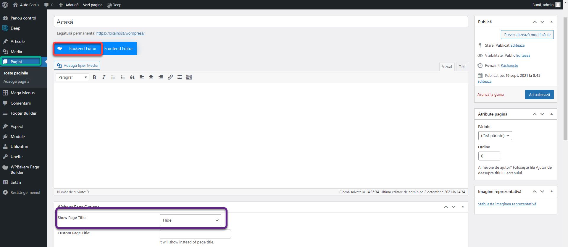
Go to the Pages section and edit the first page. The Home page does not need a title, being obviously the first page of the website. Go to the Webnus Page Option section and set the Show Page Title to Hide. Click the Backend Editor button.
Click Add Element and add a new Row block. This is the basic block on which we place all the elements.
Press the Plus button to add a block inside a row.
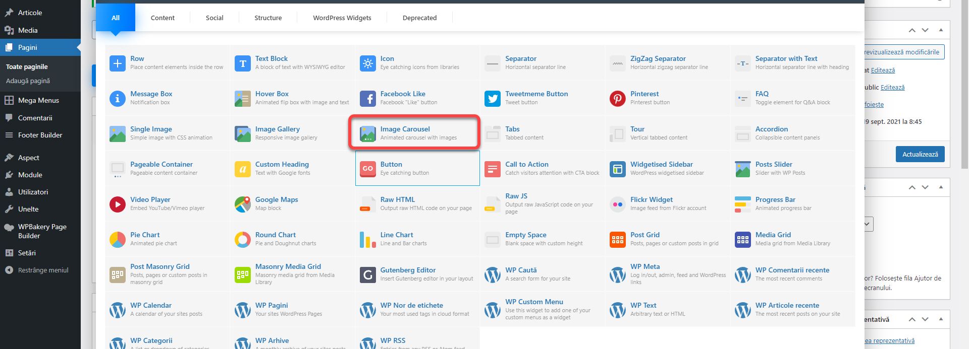
We will start with an image slider in which we will briefly summarize the services. We have prepared some images as a template, you can download them here. I normally recommend using a specialized module that allows you to place text dynamically. In its absence, I pasted the text directly on the image using Photoshop. We will discuss how to create sliders in one of the future articles. We did not choose the most successful images or the most imaginative texts because the goal is to understand how they are placed. Add the Image Carousel block.
Place the cursor on it and click on the editing pencil.
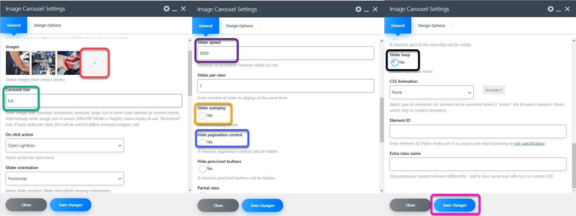
Click on the plus next to Images to add the 3 images in the archive, Slide 1, Slide 2 and Slide 3. You can change the order by dragging the images left or right. Set the Carousel Size to Full to spread across the screen. Otherwise you can give it values such as large, medium, thumbnail or a fixed size such as 200×150 (without adding px). Slider speed will be 3000 which is the duration after which the images change in ms. Check the Slider autoplay so that the images change themselves, Hide pagination control and Slider Loop to always start over. Click Save changes.
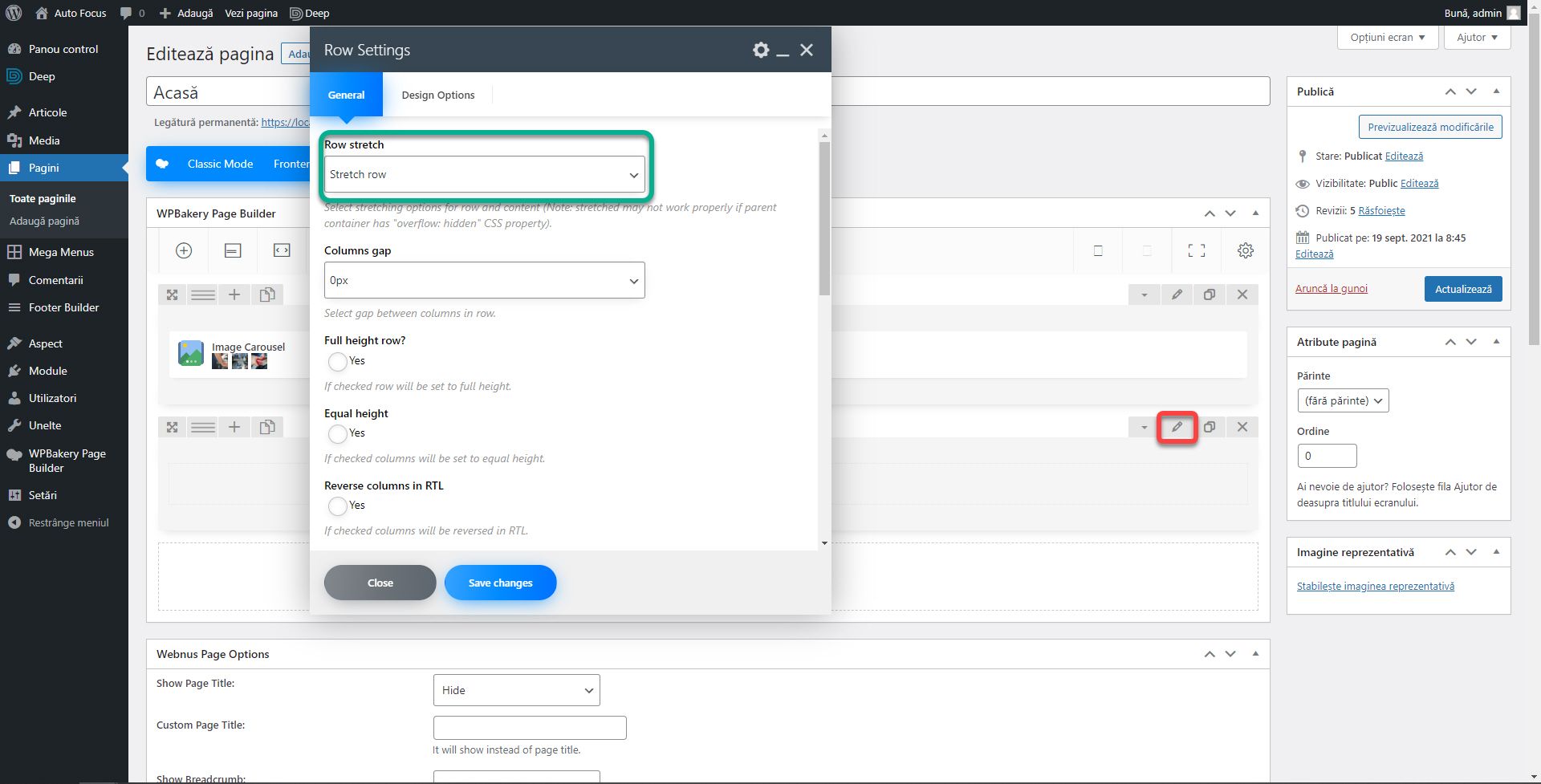
As I have written both in articles and in both books, for service providers, on the first page you need to have a short text about. Add a new row and click the edit button. From the General section, set Row stretch to Stretch row. This will stretch the entire length of the screen. Normally, Stretch row and content will stretch the row and content, and Stretch row and content (no paddings) will stick the content to the edges of the screen. We just want to expand the background. Themes sometimes change the functionality of this setting. So, even if we set the Stretch row, the content will also move. As it happens in this case.
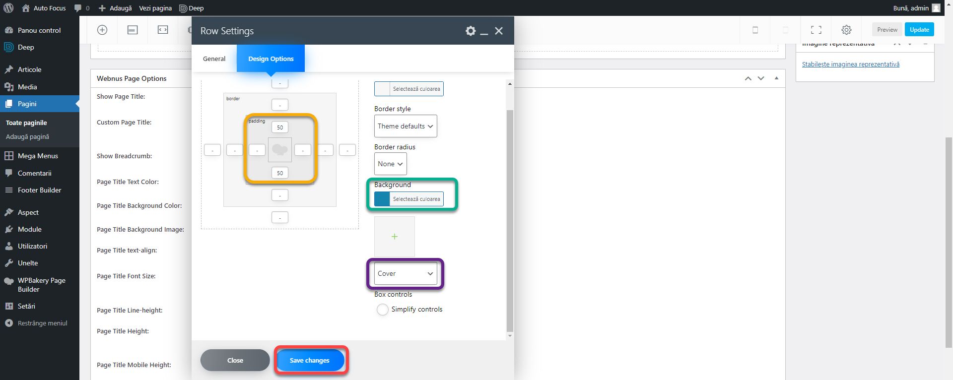
From the Design Options section, set Background to the main color #1584af and the drop-down list below in the Cover (purple box). Set Padding above 20px and below 50px. Click Save Changes. This way we will have a blue row in which to place the text.
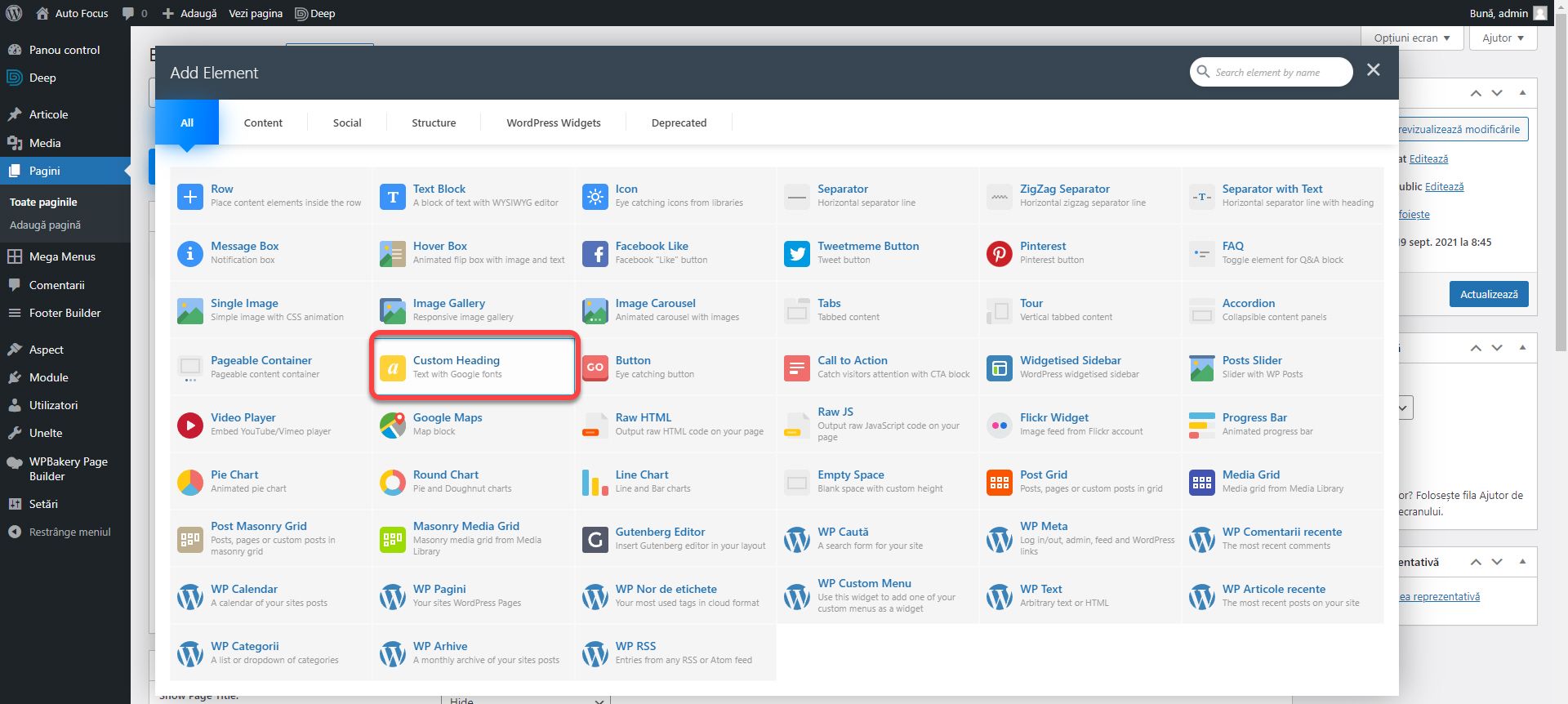
Add the Custom Heading item to the new row.
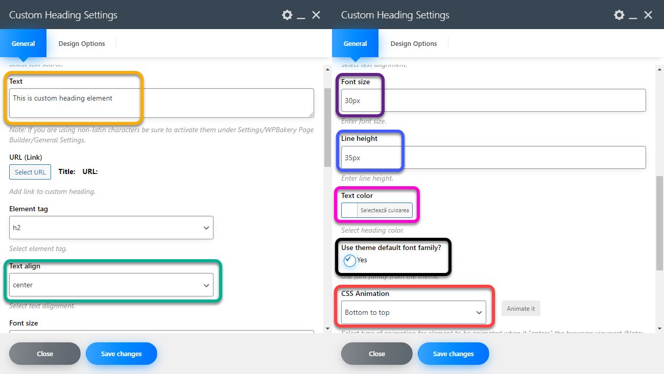
Sets the Text to About Auto Focus. Text align Center, Font Size 30px, Line height 35px, Text color #ffffff, check Use theme default font family and CSS Animation Bottom to top. The CSS Animation field is present on all blocks and allows the setting of animations. In this case, the title will come from the bottom up when it enters the field of view. The custom heading block does not offer text styling options. If you want to thicken the title, you need to add the html strong tag in the text portion like this: <strong> About Auto Focus </strong>.
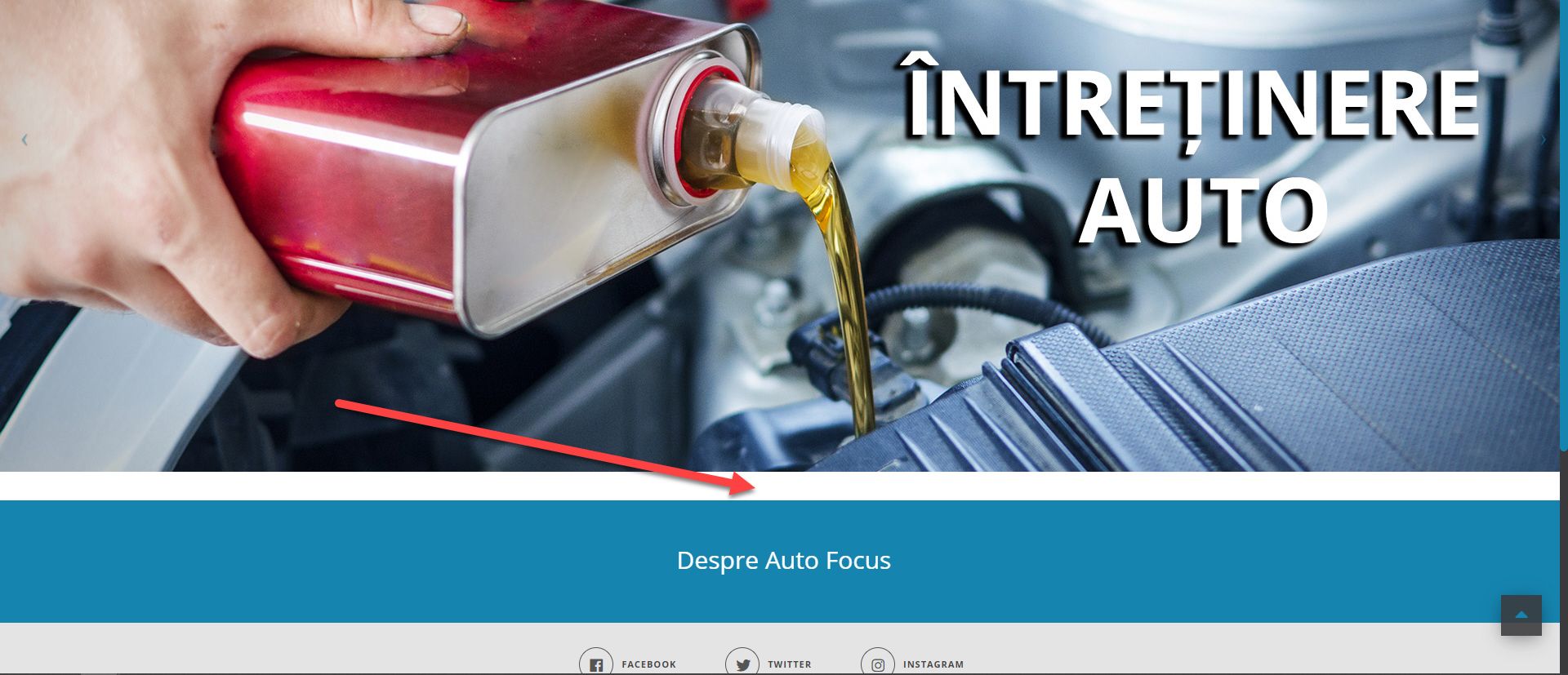
If you click on Preview changes, you will see a white portion between the slider and the new row. Appears because the elements in WPBakery Page Builder have a preset margin of 35px at the bottom. Convenient when all rows have the same background, but less pleasant in this case.
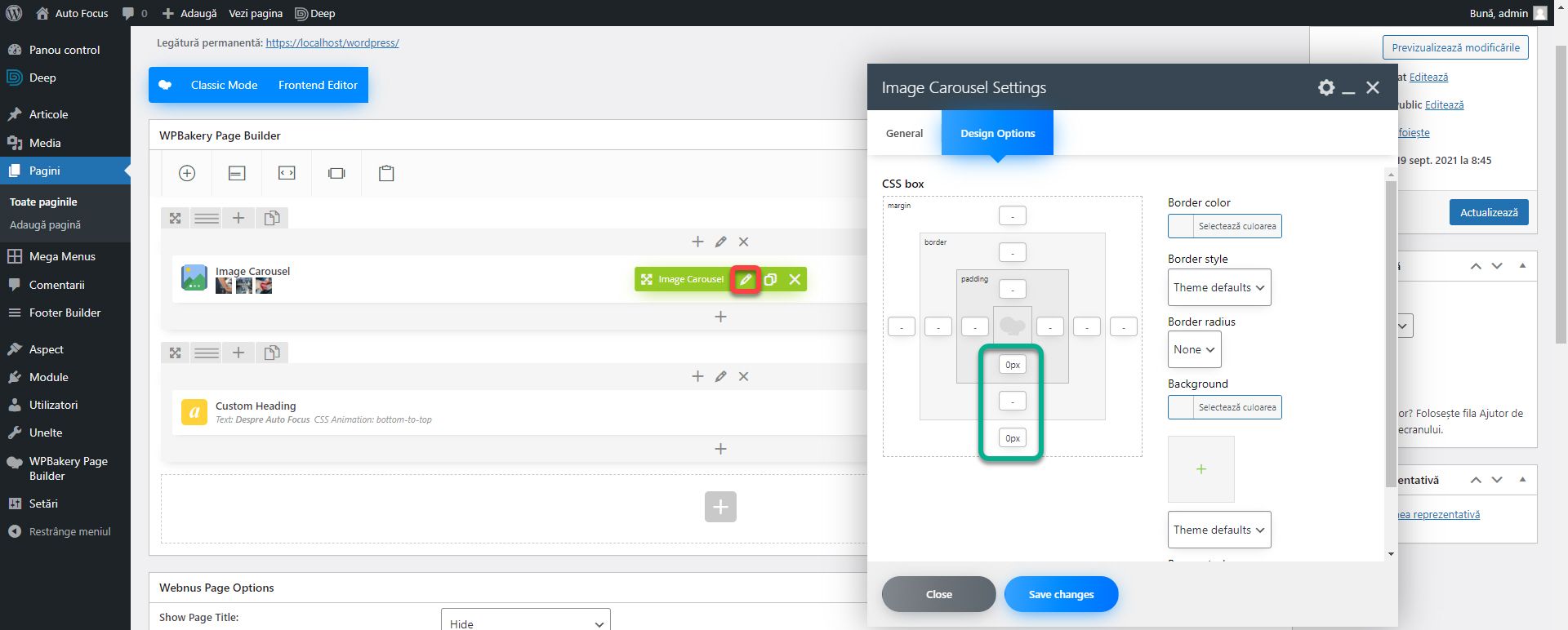
To remove it, edit the Image Carousel block, and from the Design Options section, set padding and margin 0 for the bottom.
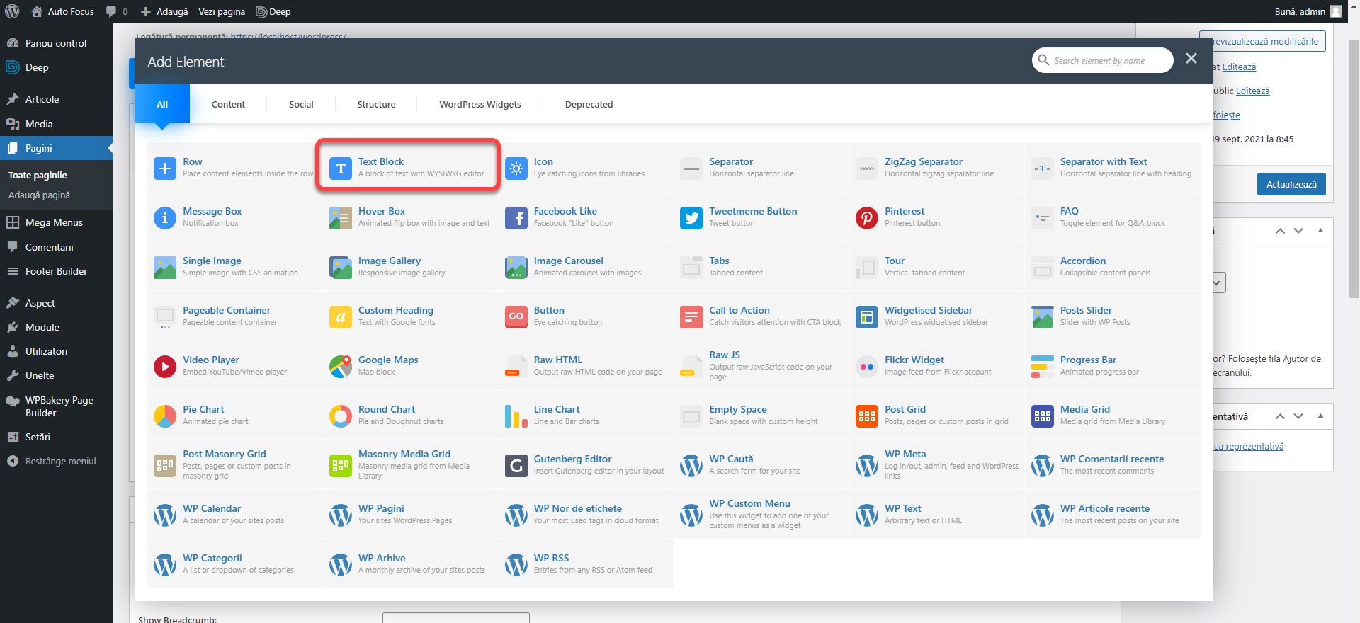
Under the Custom Heading block, add a Text Block element.
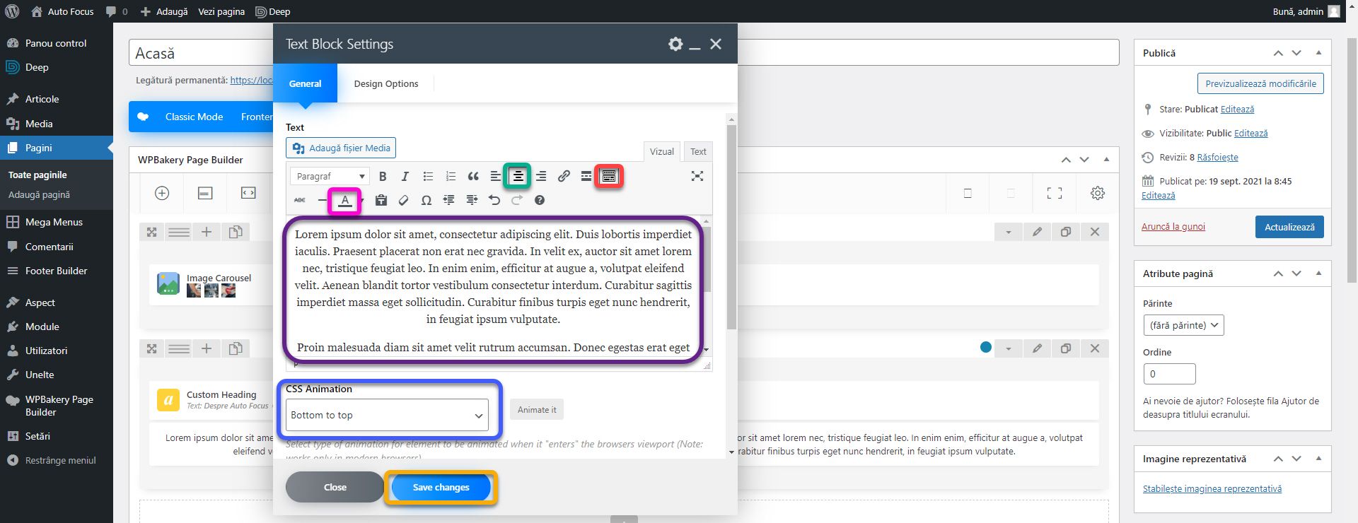
In the text space, we will add two template paragraphs. You can generate them here. Select the text, align it with the center (green box). Click on the last item on the command bar (red box) to show the hidden buttons. With the text selected, set the color white (pink box). Set CSS Animation Bottom to Top. Click Save Changes.
As I said above, this theme sticks the content to the edges of the screen. Which doesn’t make the text look too interesting or cluttered on the big screens. We will discuss in the next article what we can do in such cases using the CSS code. Because you never know when you come across a theme with such problems or when an update appears that spoils the functionality and you have to fix it quickly. It doesn’t happen often, but it’s possible. Especially for free themes!
We need to add another section of services. Add a new row. Go to the title About Auto Focus, and click on duplicate. Drag the new custom heading block into the previously created row. For this title, replace About Auto Focus with Services and set the text color to the main color (#1584AF).
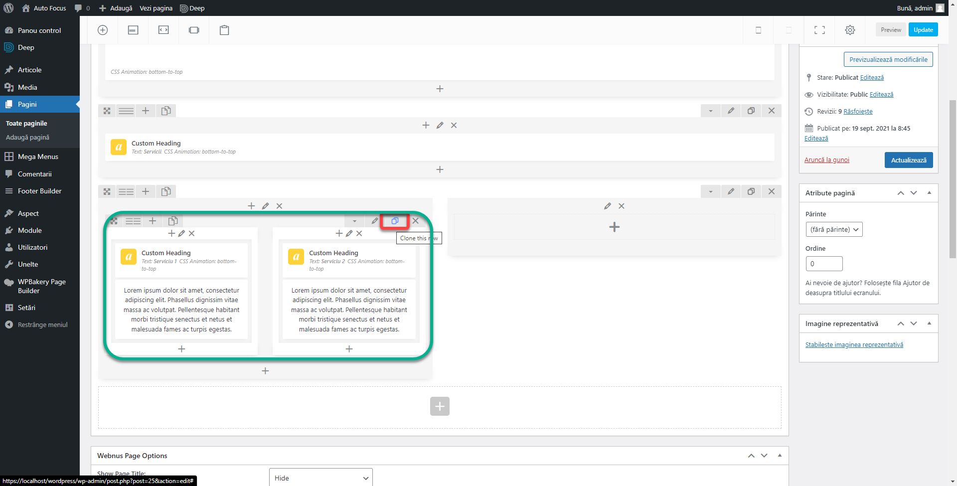
Add a new row. At the top left, place the cursor on the second button. From here you can change the number of columns. Click on 2 columns.
Inside the first column, add a new inner row. You can have rows inside other rows allowing for advanced design. Alternatively, click on the custom in the column settings and enter the 1/2 + 1/4 + 1/4 configuration. It will have the same effect only that for this example I chose to use a new row inside the first column. Place in each column of the inner row a custom heading of size 20px and black with a title of Car Service. Under each, add a block of text with a template paragraph aligned in the center. Click on the duplicate to create an identical inner row. Now we will have 2 inner rows of 2 colors, each with a custom heading block and a text block.
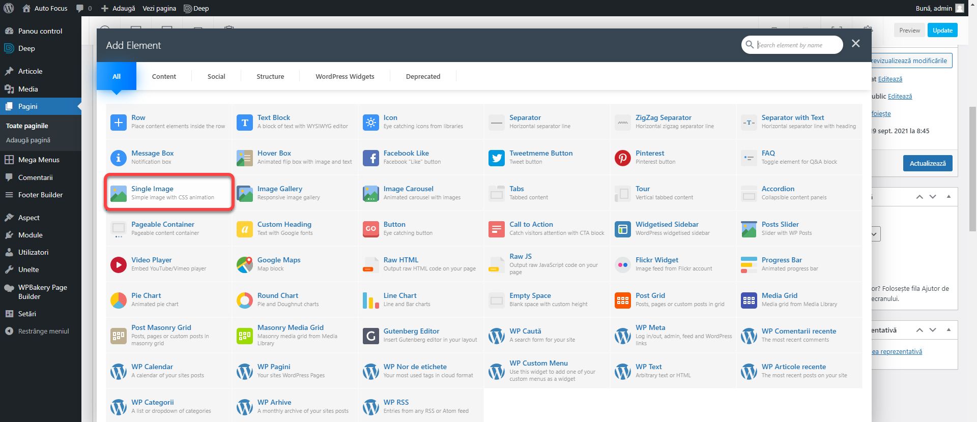
In the empty column on the right, add the Single Image block.
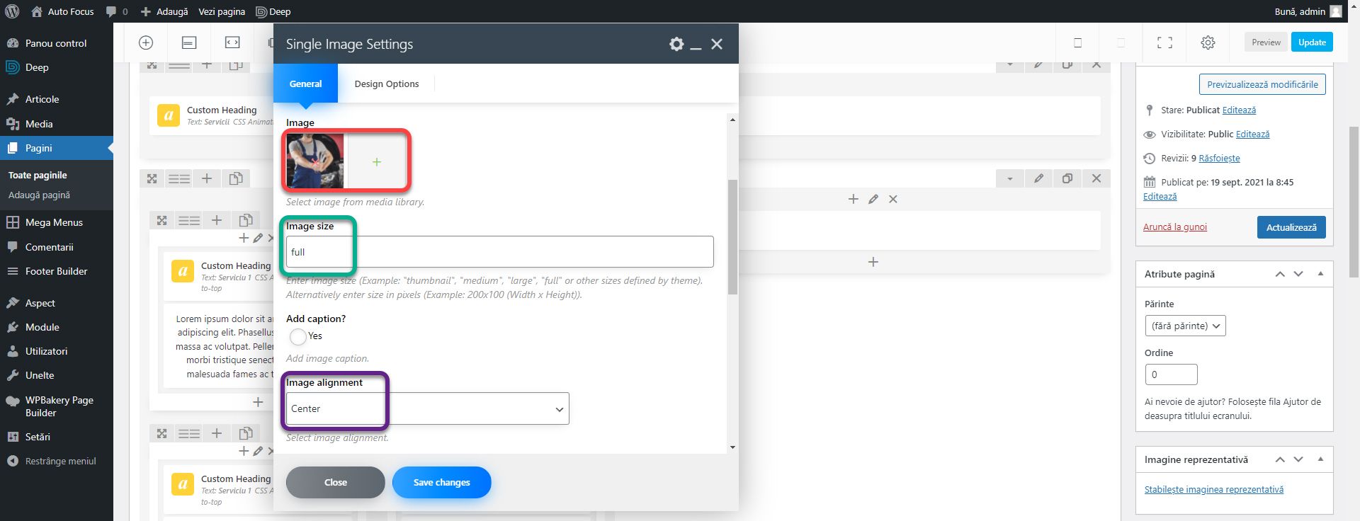
Add the img1 image from the archive (red box). Sets Image Size Full and Image alignment Center.
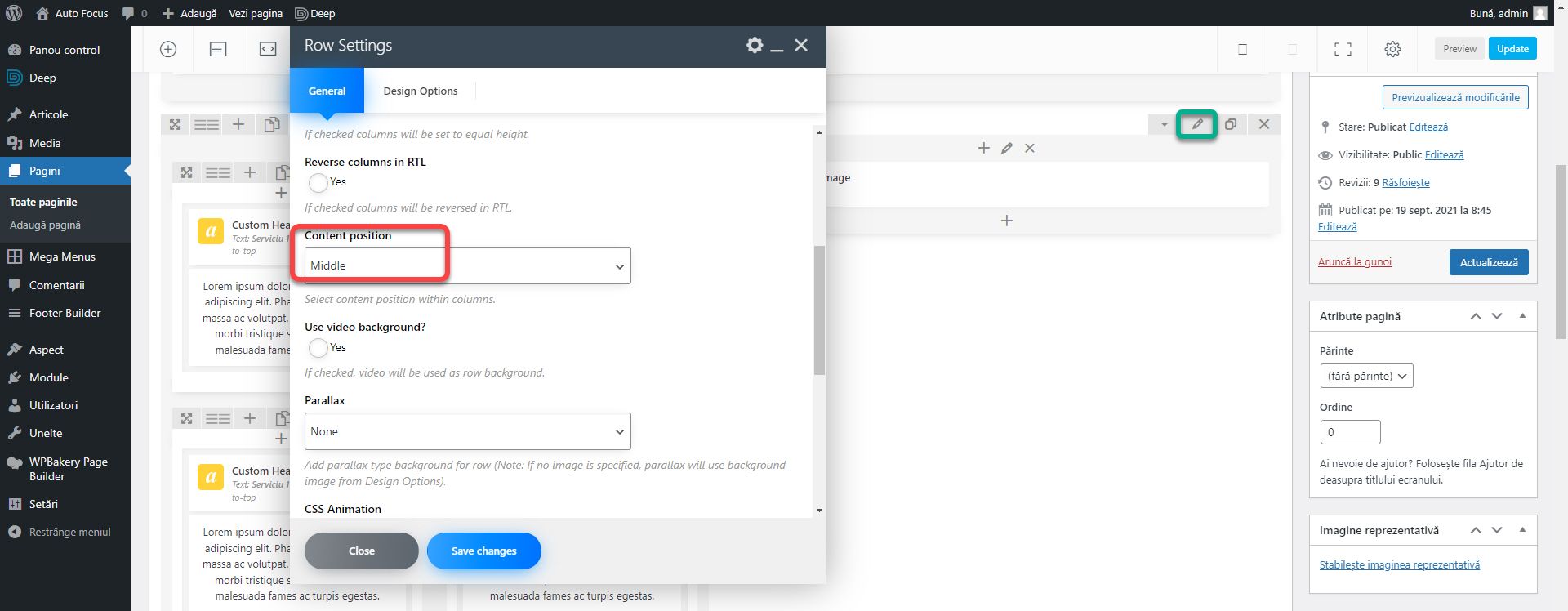
Edit the outer row using the pencil icon button, and set the Content Position to middle.
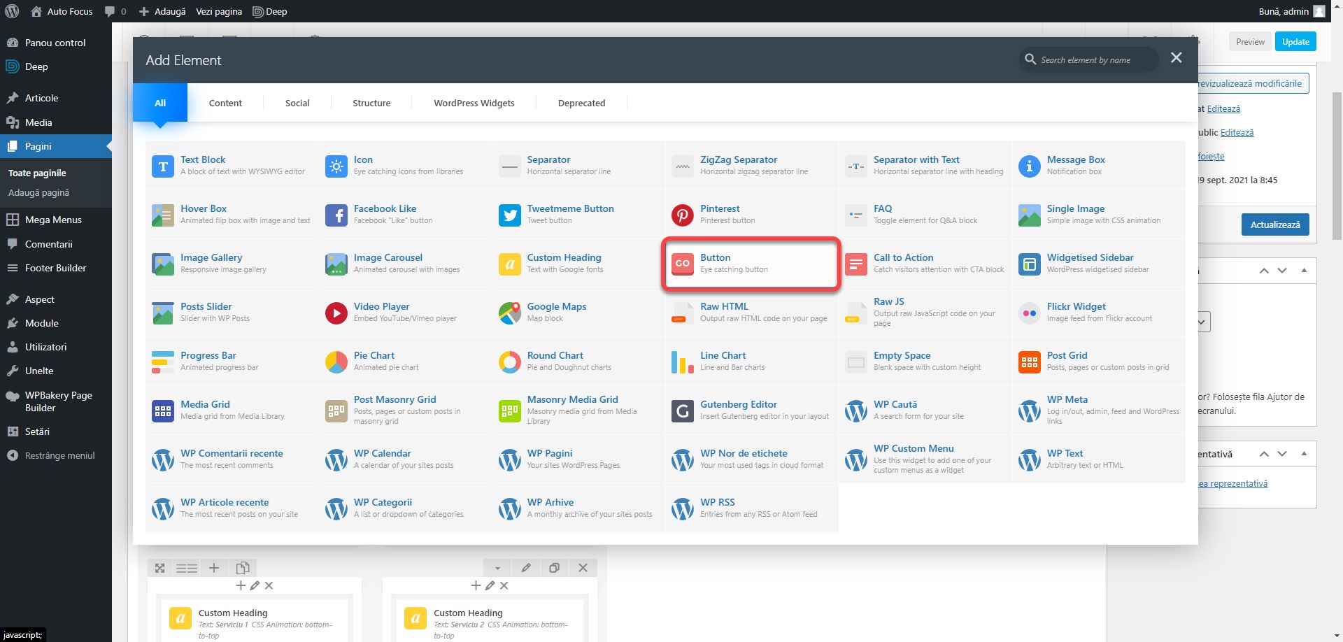
In the first column of the inner row, add a Button block.
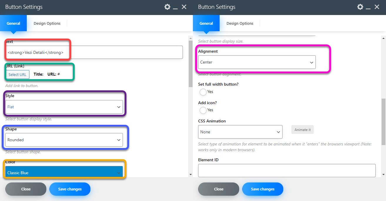
In the Text field, enter <strong> View Details </strong>. The strong tag is to thicken the text. By clicking on Select URL you can enter a link that will be accessed when visitors press the button. Since we don’t have any pages, insert a #. Set Style to Flat, Shape to Rounded, Color to Classic Blue because it is closest to our primary color (and does not allow you to insert a color outside of the list), and Alignment Center. Add buttons for other services as well.
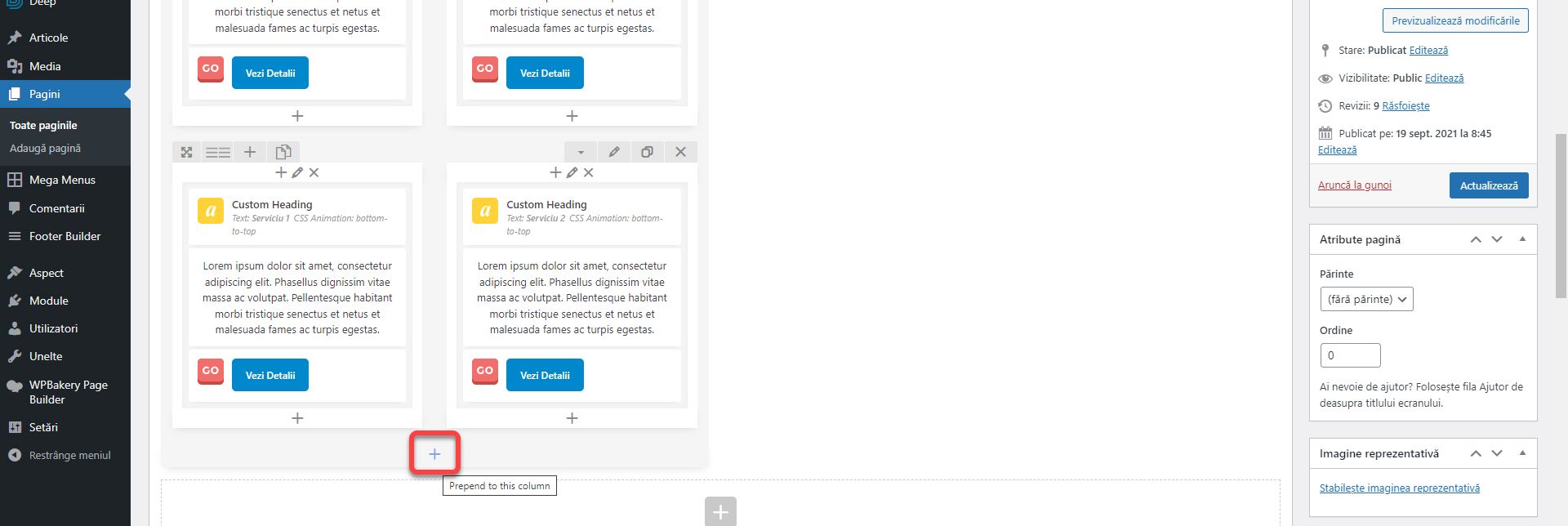
Click on the plus at the bottom of the first column in the outer row to add an item outside the inner rows.
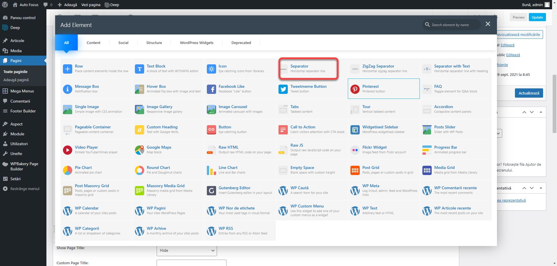
Add the Separator block. It serves to delimit sections by a horizontal line.
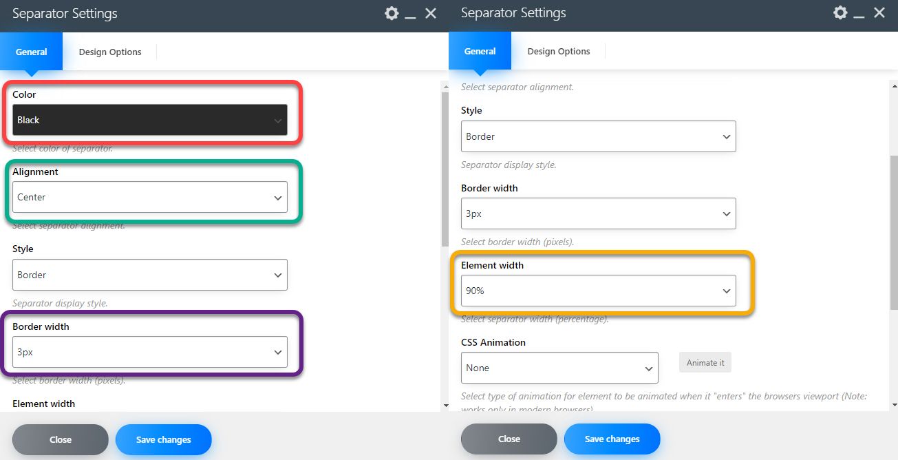
Set Color to Black, Alignment to Center, Border width to 3px, and Element width to 90%.
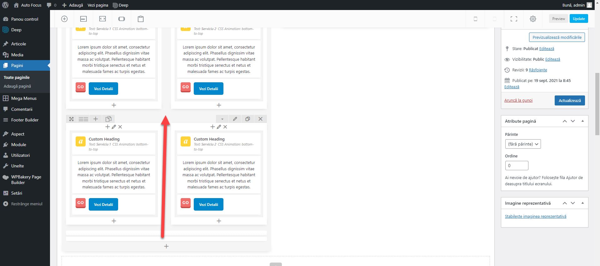
Move the separator between the two inner rows.
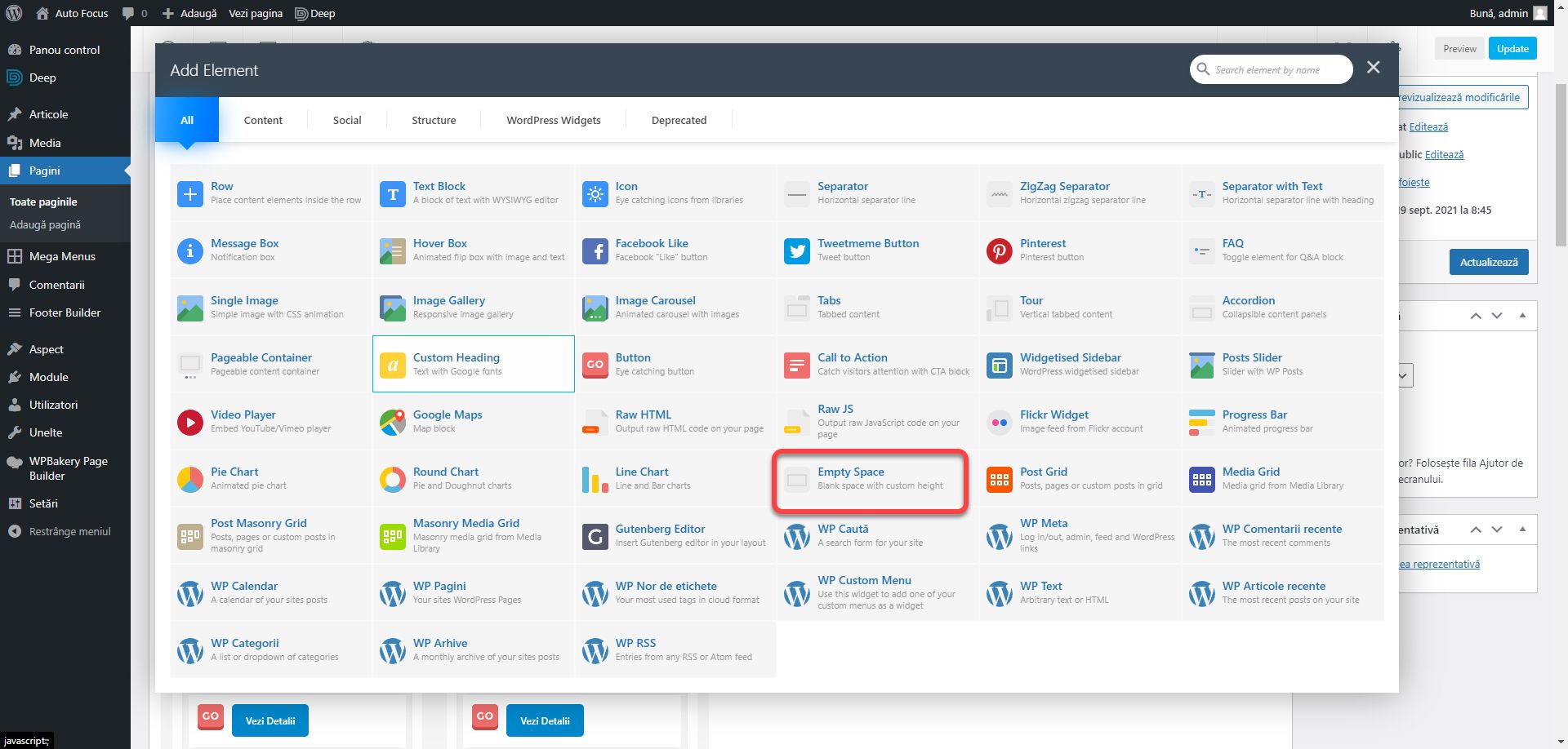
We need to add some more space under the heading Services. There are two ways to do this. Either edit the bottom field of the margin attribute as we did earlier in the article, or add an Empty Space element in the same row. The initial value of 32px is sufficient.
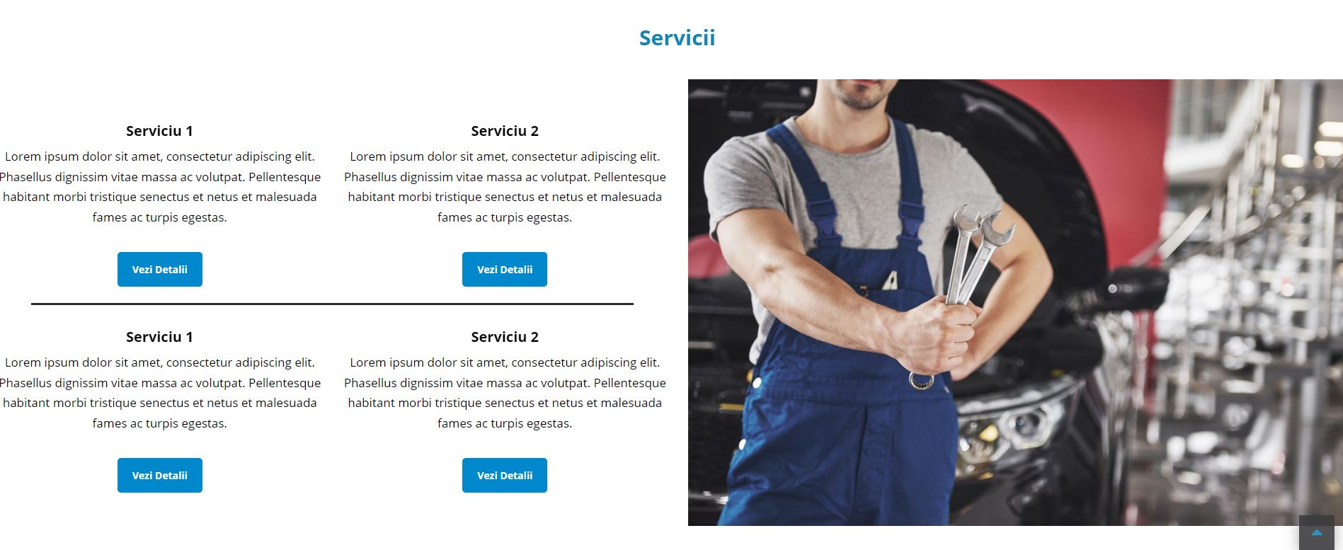
Finally, the last section should look like the image below.
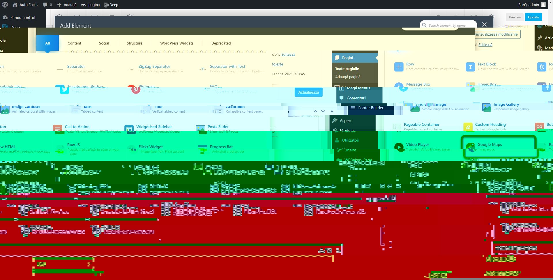
Add a last row with the Google Maps block.
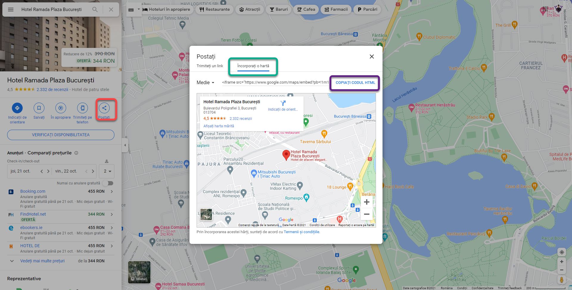
Go to https://www.google.com/maps and navigate to any address. Click the Post button and from the new window go to the Embed a map section and click COPY HTML.
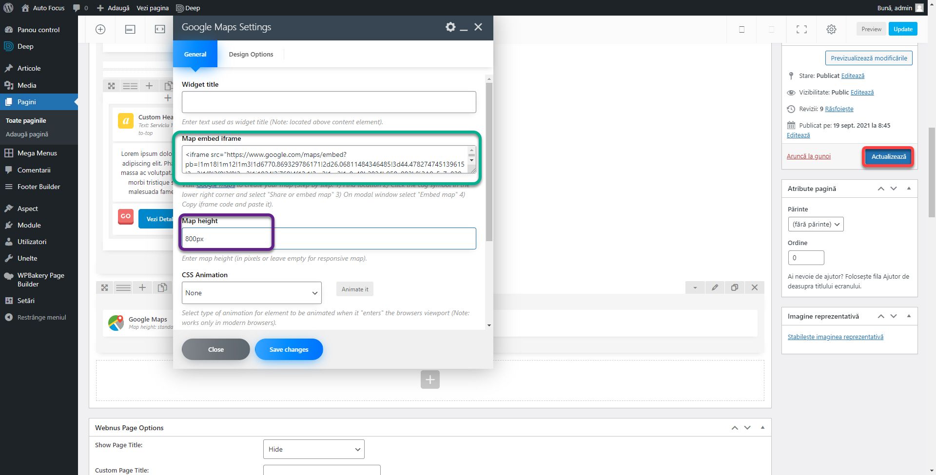
Insert the copied code into the Map embed iframe section of the Google Maps block and set Map Height to 800px. To paste the footer block, set the block, column, and row (in the Design Options section of each of the corresponding settings) Padding and Margin 0 for the bottom. Click the Update button on the right bar to save the page.
These are the most important blocks. Once you know these you can easily explore the others being built on the same pattern. In the next article we will fix the small shortcomings of the theme using CSS code.
There are two articles you should read at this time:
- Design Techniques: The 5 Aspects for a Successful Website
- Website Structure and Content Architecture
Of course, the book The Online Business Guide has all the necessary details.
If you are confused or need help, I am waiting for you on the SenDesign Community Facebook group!
