How to create a website #7: How to create a beautiful website (II)
22/10/2021
How to create a website #9: Mobile optimization
04/11/2021
How to create a website #7: How to create a beautiful website (II)
22/10/2021
How to create a website #9: Mobile optimization
04/11/2021How to create a website #8: Advanced customizations
In WordPress you work with themes and plugins. Both these and the platform have an update cycle. Some updates may change the way certain settings work, others may change the way the design is interpreted, or they may simply bring issues that are waiting to be resolved in the next update. Regardless of the situations listed, you need to quickly solve the design problem and then use the CSS code.
It is not necessary to always have a problem, sometimes you may just want to get a certain design and no option or plugin will help you. As we noted in previous articles. I made this introduction to highlight that although WordPress does not require programming knowledge, you get in time to use it. As much as you run away from them, it is much easier to insert 2-3 lines of CSS code than to look for plugins or themes that allow advanced editing in specific situations.
It’s time to address the shortcomings of the theme and the Gutenberg editor. I do not intend to teach the whole theory of language. You can find everything you need on W3Schools. Instead I will show you where to insert the code and how to identify what classes you need. It is absolutely okay not to understand certain steps. I will give you the code you need and in time, things will become clear.
Global Styles
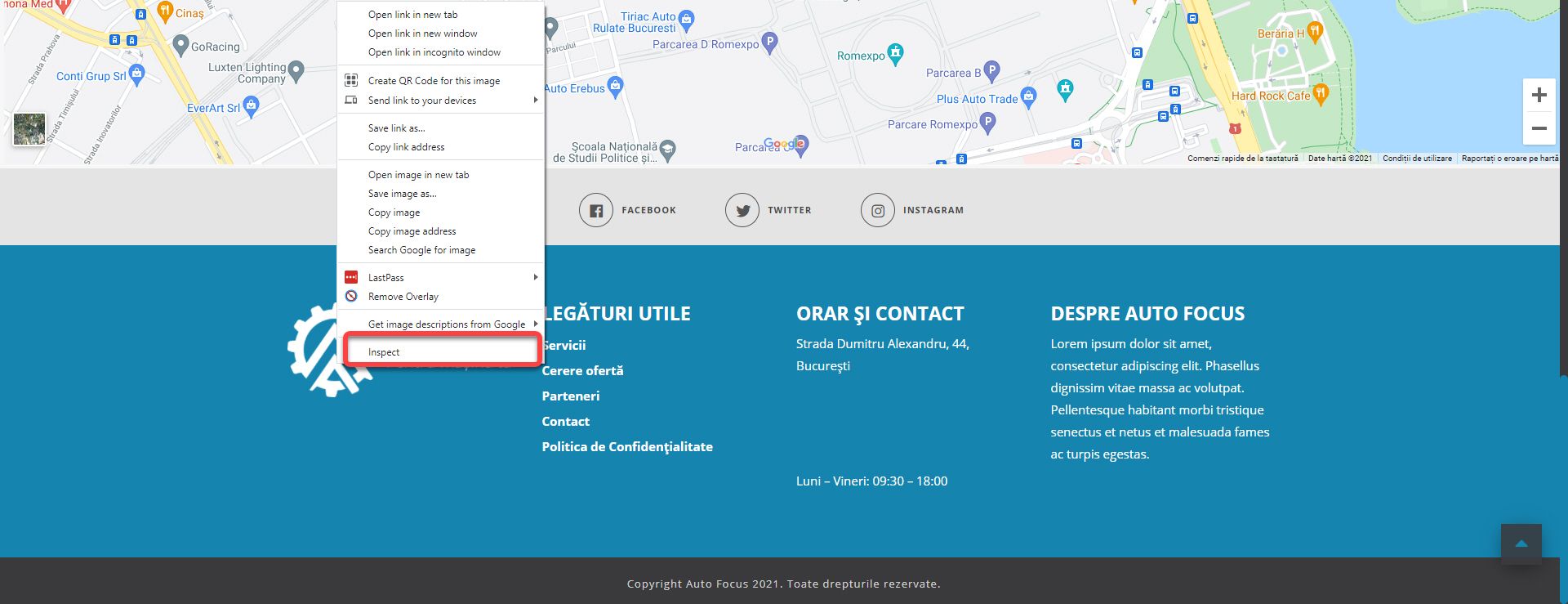
The notion of global refers to the fact that it applies to the entire website. Open the website, scroll to the Footer section, place the cursor on the logo and right click. From the new window click Inspect / Inspect Element (depending on the browser).
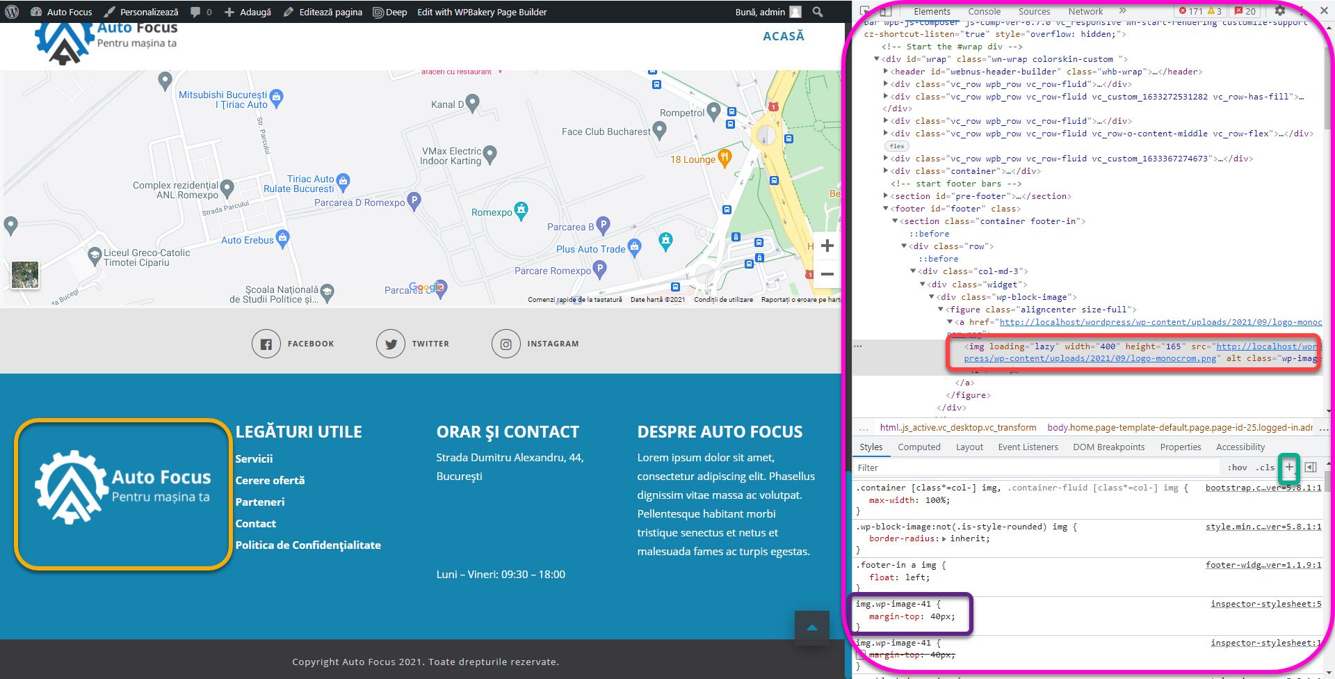
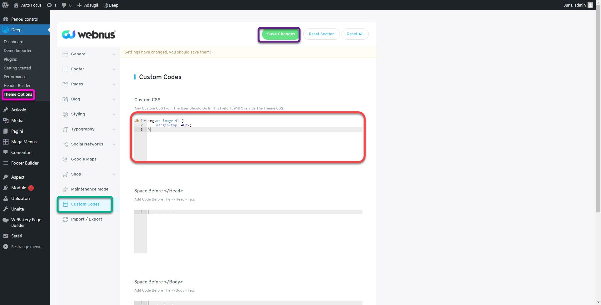
A window will open in which we will see the source code of the page. Walking the cursor through the lines of code you will be able to see what element it represents. Click on the line starting with img (red box). Click on the plus in the middle right to add a new class. A new row called img.wp-image-41 will be created in the bottom window. Type margin-top: 40px and notice how the white logo moved to the vertical middle of the other columns. This way you find out which classes you need to edit to get a specific design, and you will be able to see the result in real time. If you reload the page, everything will return to its original form.
To save these changes, go to Theme Options, Custom Codes section. Copy the code you entered earlier and paste it into the Custom CSS field. Obviously, click Save Changes. Thus, we saved the change of the position of the logo globally. The first step is to identify the CSS class / id that will modify the element as you wish. The second step is to test the code that will make the change, and the last step is to insert the resulting code in the Custom CSS option of the theme. Any theme must offer this functionality.
The discussion is much longer, but we will not go into more detail so as not to start an entire CSS course. I just want you to know that you can change anything to your heart’s content. It’s time to fix the next column, the list under USEFUL LINKS. The code is:
.widget ul, .widget ul li {

list-style: disc;

color: #fff !important;

padding-left: 20px;

}
We use the .widget class to change only the widget elements, the lists in the rest of the page will not be affected. We use! Important to force change where the theme still refuses. To change the color of the links in Footer the code is:
.widget a {

color: #fff !important;

}
.widget p {

margin-bottom: 5px;

}
This makes the phone number and email address visible under HOURS AND CONTACT. .widget p changes the distance between paragraphs, making the text more arranged. We only have the ABOUT AUTO FOCUS column. Normally, I use the whole .widget p to make changes to it. Not having a unique identifier. But that will change every widget paragraph, when we just want to change it.
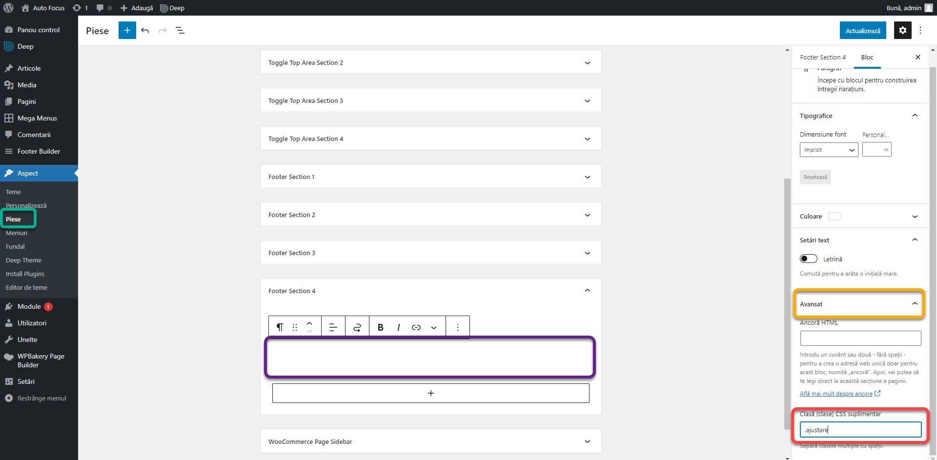
Go to the Parts Editor, Footer Section 4, click on the paragraph, on the right, click on Advanced and in the CSS Class field insert the adjustment text. Save changes.
Thus this paragraph will have a unique class. Enter the following code in Custom CSS in Theme Options:
.ajustare {

text-align: justify;

}
It will align only that paragraph to the outer edges. Sometimes it is easier to add a class with which to modify an element or block than to look for its identifiers and overwrite them. In the end, the Footer should look like the picture below. Much more orderly and with all the wishes of the previous article resolved.
Local Styles
There is only one problem left to solve, the text on the first page of the About section. As I said in the previous article, in the current version the theme does not take into account the limit of the container and the content is spread all over the screen. We will define a special class with which we will set the limit. Add the following code to Custom CSS:
.cont{

max-width: 1300px;

margin-left: auto;

margin-right: auto;

}
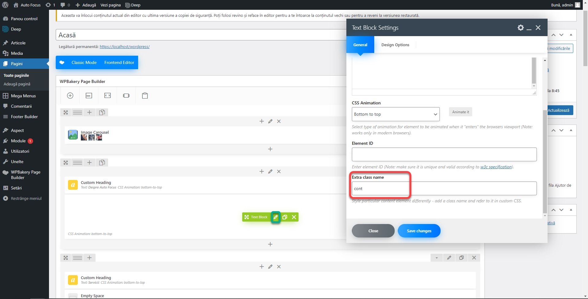
We use max-width instead of width to set only the maximum width, otherwise it will have 1300px regardless of the device which is not ok. The car side will center the container in the middle. Go to the Home page and edit the text block under About. In the Extra class name field, enter the class name, account.
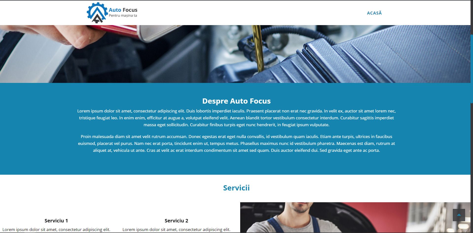
Now the About section looks more orderly.
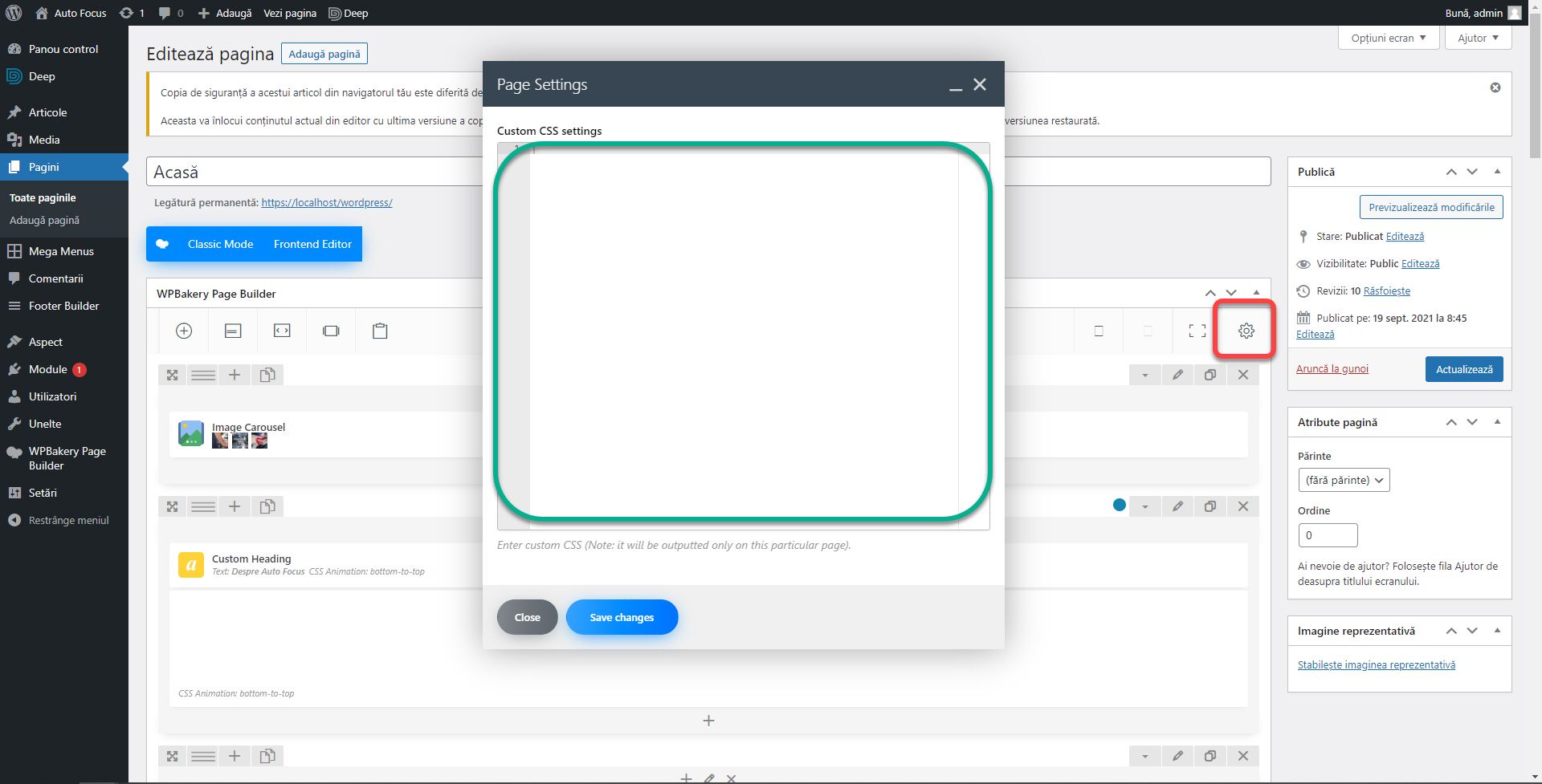
Often, you will only need to define styles within a page. For example, we have the cont class defined at a width of 1300px, but we can overwrite this value in an individual page. Sometimes themes offer this option, other times they don’t. It is another plus of the WPBakery Page Builder mode, it offers the Custom CSS option in any page or post regardless of the theme.
Press the wheel on the top right. A window will open where you can enter the code. It will only affect the current page.
That’s it about customization through CSS. It’s not complicated once you understand how to identify classes or how CSS works. I did not intend to address this topic, but while preparing the material for the articles, I came across these issues that were not present a few updates ago. Widgets had a different editing method in the previous WordPress version. It wasn’t based on Gutenberg, which made it a little more versatile. Also, the theme was not a problem when I initially tested it. Which led me to think that this could happen to you too, and you need to know how to fix it.
If you are confused or need help, I am waiting for you on the SenDesign Community Facebook group!


