How to create a website #8: Advanced customizations
29/10/2021
How to create a website #10: Contact forms
12/11/2021
How to create a website #8: Advanced customizations
29/10/2021
How to create a website #10: Contact forms
12/11/2021How to create a website #9: Mobile optimization
Mobile optimization is a sensitive topic. Their growth in popularity has made optimization essential and in some cases has led to complete ignorance of the desktop segment.
In the article How should a website look on mobile, we described how a website should look and behave on mobile devices. Read this article to understand the concepts before moving on to the practical part. You can also find the information in my books or in the SenDesign Community group.
Optimization testing
One of the great advantages of WordPress and WPBakery Page Builder is that much of the mobile optimization takes place automatically. At least technically. Instead, we need to optimize conceptually. Since all the columns become rows below each other, we need to make sure that the navigation is easily achievable. That there is enough space between the elements and that the text is legible. Our website has adapted quite well for mobile but improvements can be made.
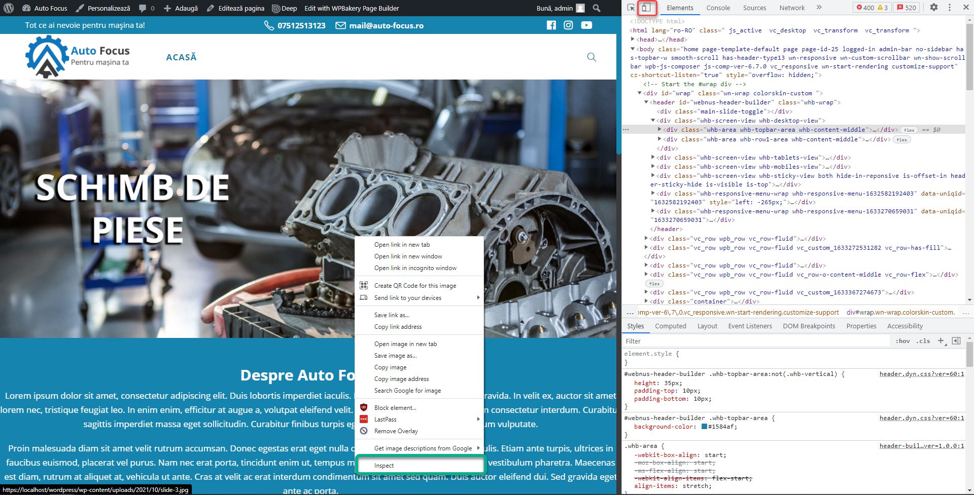
The first method of testing optimization takes place through the browser. Right click anywhere on the website and choose Inspect / Inspect Element. From the window that opens, click on the second icon (the one with the phone and the tablet).
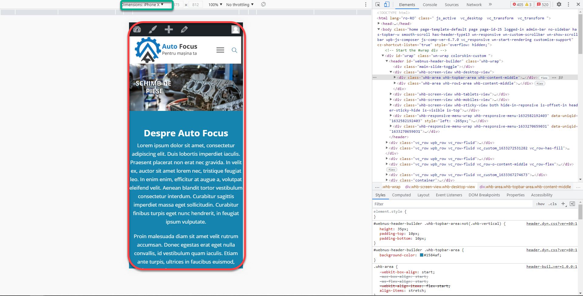
The website will be resized and you will be able to preview its appearance on mobile (red box). From the top bar, you can control which device to simulate. It’s a good way to quickly test a website.
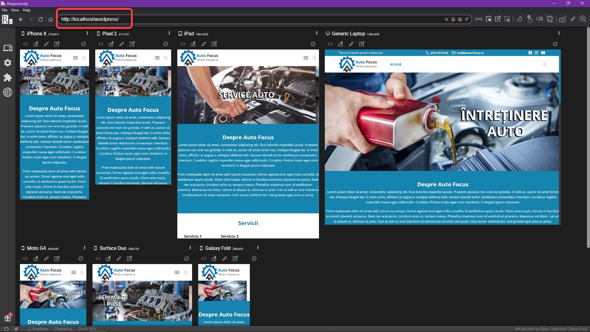
A second more advanced method is the Responsively application, which you can download here for free. Download it, install it and open it. Enter the website address in the top bar and press Enter. The website will open simulated for several types of devices. Navigation takes place simultaneously or separately, according to preference.
Header optimization
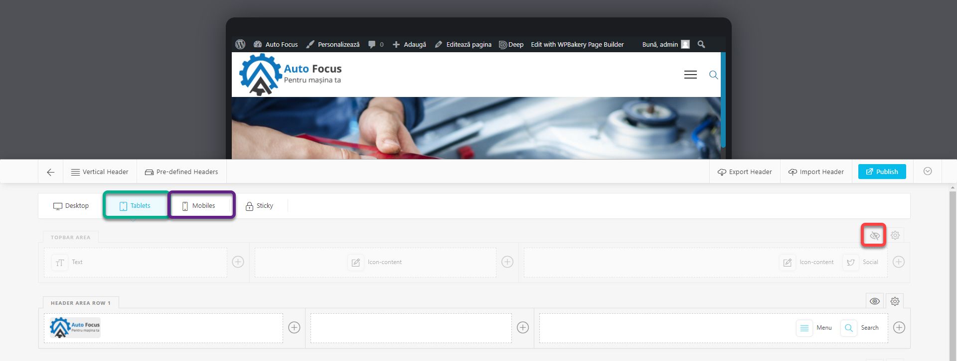
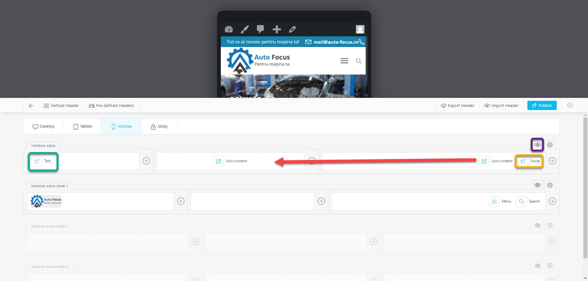
The theme does a pretty good job of optimizing the header. Automatically hides certain items and the menu appears after pressing the hamburger button. We will improve the section a bit to understand how it works. Go to Header Builder and click on Tablets. You’ve probably already noticed that the Topbar Area is hidden on tablets, although there’s enough space to show all the items. Click on the eye to make it visible. In the header builder, you can hide, show and position different elements in the 4 sections: Desktop, Tablets, Mobiles and Sticky. A change in Tablets will not affect the rest of the sections. Except for deletions and additions, which occur in all types of devices (without Sticky) simultaneously. Go to Mobiles.
And here we will show the Topbar Area, but we will hide the elements that do not fit. Hide the slogan and social networks being dispensable. In my case, the phone number has a different position from the desktop, because I originally created it in the right column. If it’s the same for you, move it to the middle column in front of the email address.
In most cases, both the phone number and the email address fit on the mobile. But if you consult the Responsively application, you will see that on Galaxy Fold, the new guide launched by Samsung, the email address comes out of the screen which is not acceptable. We will have to give up one of them, but only on this type of device. I chose the phone number. Edit the block, go to Class & ID, and insert the galaxyFold class in the Extra Class field.
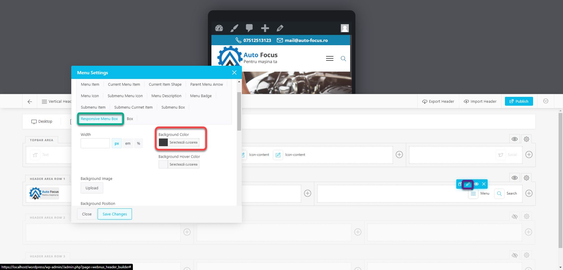
To change the menu attributes on mobile, edit the block, go to the Styling section, the Responsive Menu Box subsection. In the Background Color field, insert #3a3a3c, ie the secondary color. Do the same for the tablet version.
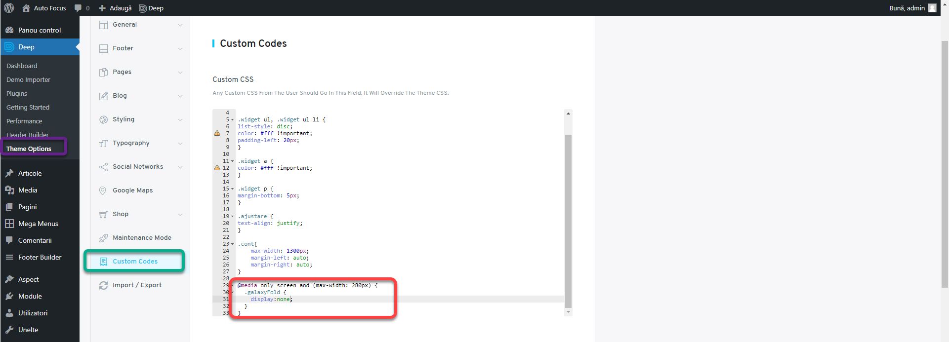
Post the changes and go to Theme Options, Custom Codes section. In the Custom CSS field add the code:
@media only screen and (max-width: 280px) {

.galaxyFold {

display:none;

}}
We use @media only screen and (max-width: 280px) to create styles that apply only under certain conditions. In this case, for devices with a maximum screen width of 280px. More details here. That is, the phone number will be hidden on the Galaxy Fold. I took the resolution from the Responsively application. This is not the resolution in the specifications, but the viewport, which is the current space available for displaying items on a screen. I talked more about this in the new book: Successful Web Design.
Page Optimization
Going further, we notice that the slider is too small on the mobile. Unfortunately, the only solution is to create another with other images that will only be displayed on mobile. I will present a smart slider module that makes the process easier in one of the following articles. The About section has lipid text at the edges of the screen. To correct this, add the code:
@media only screen and (max-width: 768px) {

.cont{

padding-left:20px;

padding-right:20px;

}}
It will add an interior space of 20px to the left and right of the text with the account class on all devices up to 768px wide. This includes tablets.
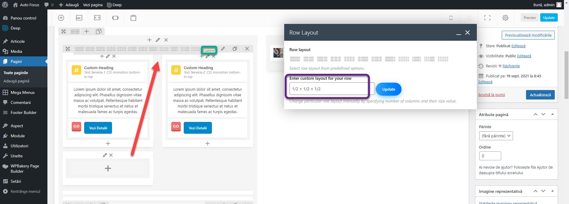
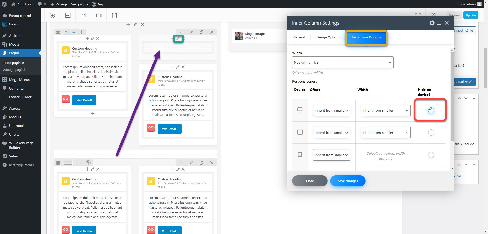
On mobile we notice that in the services section, the separator is just below the second service. Optimally, it should be present under all. For this we will resort to a trick. Edit the page and go to the services section. For the first inner row, edit the number of columns. Choose the Custom option and insert 1/2 + 1/2 + 1/2. An extra column appeared the same size as the others. But since the total sum of the columns is greater than 1, it will be below, having no place in the row. Pull the new column between the 2 existing ones. Do the same for the next inner row.
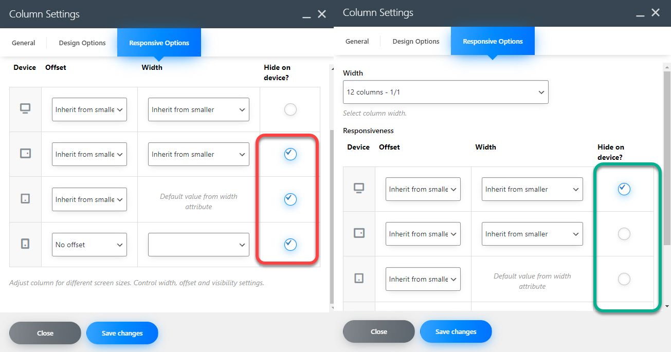
In WPBakery, we have control over which columns to display depending on the type of device without using CSS code. Duplicate the separator between the inner rows and move it to the new column. Click on the edit button of the column, go to the Responsive Options section and check the first row under Hide on device. This will hide the column on the desktop. Tick rows 2 and 3 that refer to tablets in portrait or landscape mode. If we wanted to hide the column on mobile, we would have ticked the last line. Repeat the procedure for the next row. We will now have a separator under each mobile service.
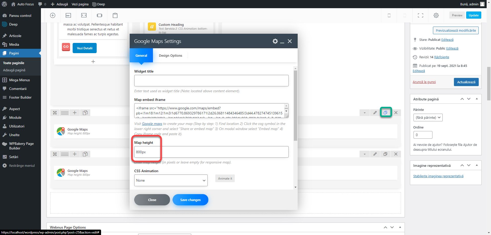
We still have to shrink the map. Duplicate the row containing the Google Maps block. Edit the block in the newly created row and change the Map height value from 800px to 400px.
Edit the column with the 800px map and hide it on tablets and mobiles and the 400px one, hide it on the desktop.
That’s about it for mobile optimization right now. You have all the tools you need to hide or adapt items on mobile versions. You can find a lot of theory in my books or on the Facebook group about how a website should look or behave.
If you are confused or need help, I am waiting for you on the SenDesign Community Facebook group!
