How to create a website #3: Customize the theme
24/09/2021
How to create a website #5: Creating pages and posts
08/10/2021
How to create a website #3: Customize the theme
24/09/2021
How to create a website #5: Creating pages and posts
08/10/2021How to create a website #4: Header and footer
The header and footer remain the same regardless of the page. Just like a brochure. Personally, after setting the theme, I prefer to define these two.
As I said on the SenDesign Community, and in The Online Business Guide, when you build a website you have to follow the branding rules. More details on these in this article. The header and the footer in a brochure have the role of defining the company, of formalizing the document and of framing the brand. The same goes for the website. That’s why I recommend that you configure these two elements before defining pages.
Header
The header, plays a very important role. It is the first element that appears on the website and the most obvious. The Deep theme comes with a very useful feature called Header Builder. It is the strong point of this theme and differentiates it from all other free themes. Instead, the premium BeTheme theme offers a little more than that, but for a fee.
From the WordPress control panel, click Deep and then Header Builder.
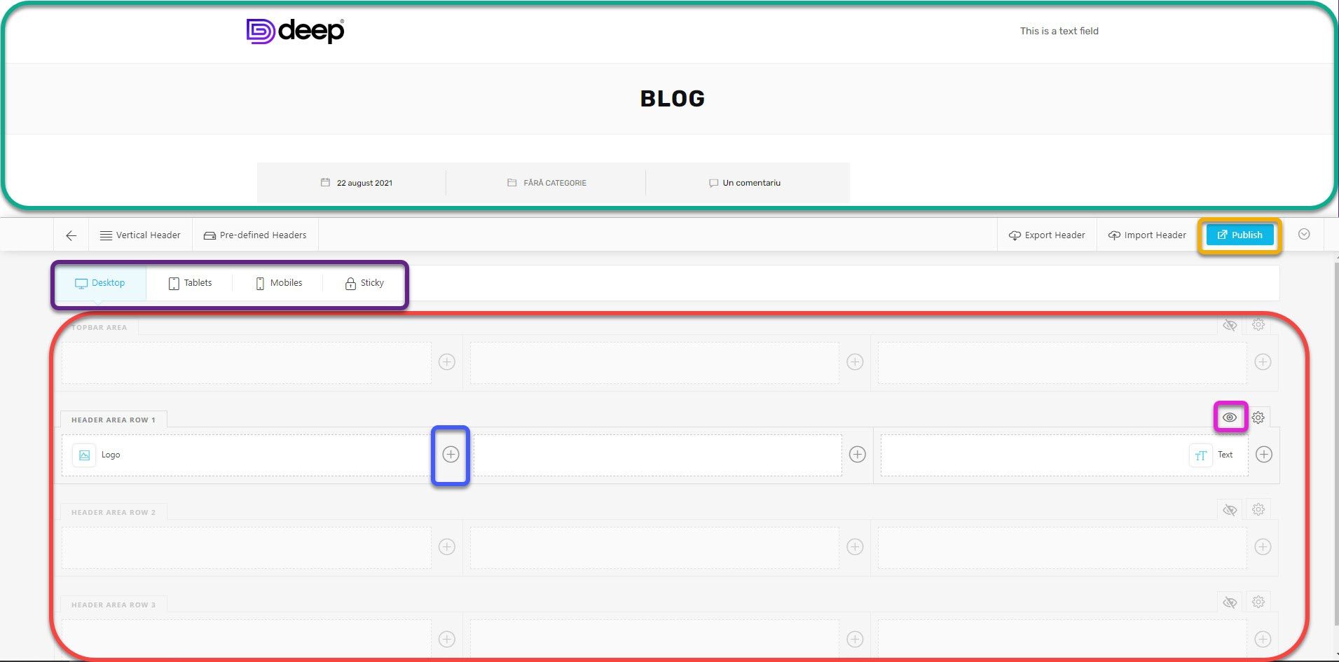
From this window we can easily add or remove items from the header. At the top (green box), you can preview any changes. At the bottom (red box), there is the section where you control the elements. You can add up to 4 rows of content arranged in 3 columns. To show or hide a row, tap the eye symbol next to the desired row. To add an item, click the plus symbol next to the desired column and row. You have 4 display modes (purple box): Desktop, Tablets, Mobile and Sticky. The first three refer to the screen size. That is, you can have a different location and different elements depending on each type of device. The fourth option, Sticky, refers to the drop-down menu when the user scrolls. That is, it always stays above the content no matter how far you scroll into the page. Any changes you make will be displayed in real time at the top. To save the changes, click Publish.
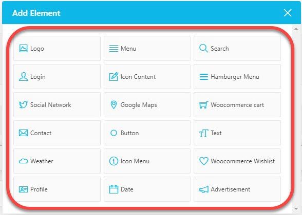
Pressing the add (+) button will open a list of items to choose from. The premium version offers a longer list. After adding an item, a configuration window will open. I will not explain every type of element now, we will go through the most important ones in a practical case-study.
If you place the cursor on an element, you will have 4 options. The first one will copy it, and when you click on the add button you will have the option to insert a copy. The second will open the options panel. The third will hide the item. Be careful, it will only hide the current device type. That is, if you hide it on the desktop, it will still be visible on tablets or mobiles and vice versa. This way you can have different elements with different configurations depending on the screen size. The fourth option will delete the item for all device types.
You can be quite creative while creating the header, the range of elements being quite generous even on the free version of the theme. We will explore positioning and key elements in one of the future articles. For now, it is enough to be familiar with this window.
Footer and Top Area
The footer, which I will refer to as a footer, is at the bottom of the website. In the previous article we explored the options offered by the theme for customizing this section. We will now explore adding the actual content to the footer.
In WordPress there are certain elements called Widgets. Just like the ones on the phone, they are used to display content in static sections of the website such as Footer, on the left or right of the pages or in the case of this theme in the Top Area if you have activated it from the settings.
From the Appearance section, click Widgets.
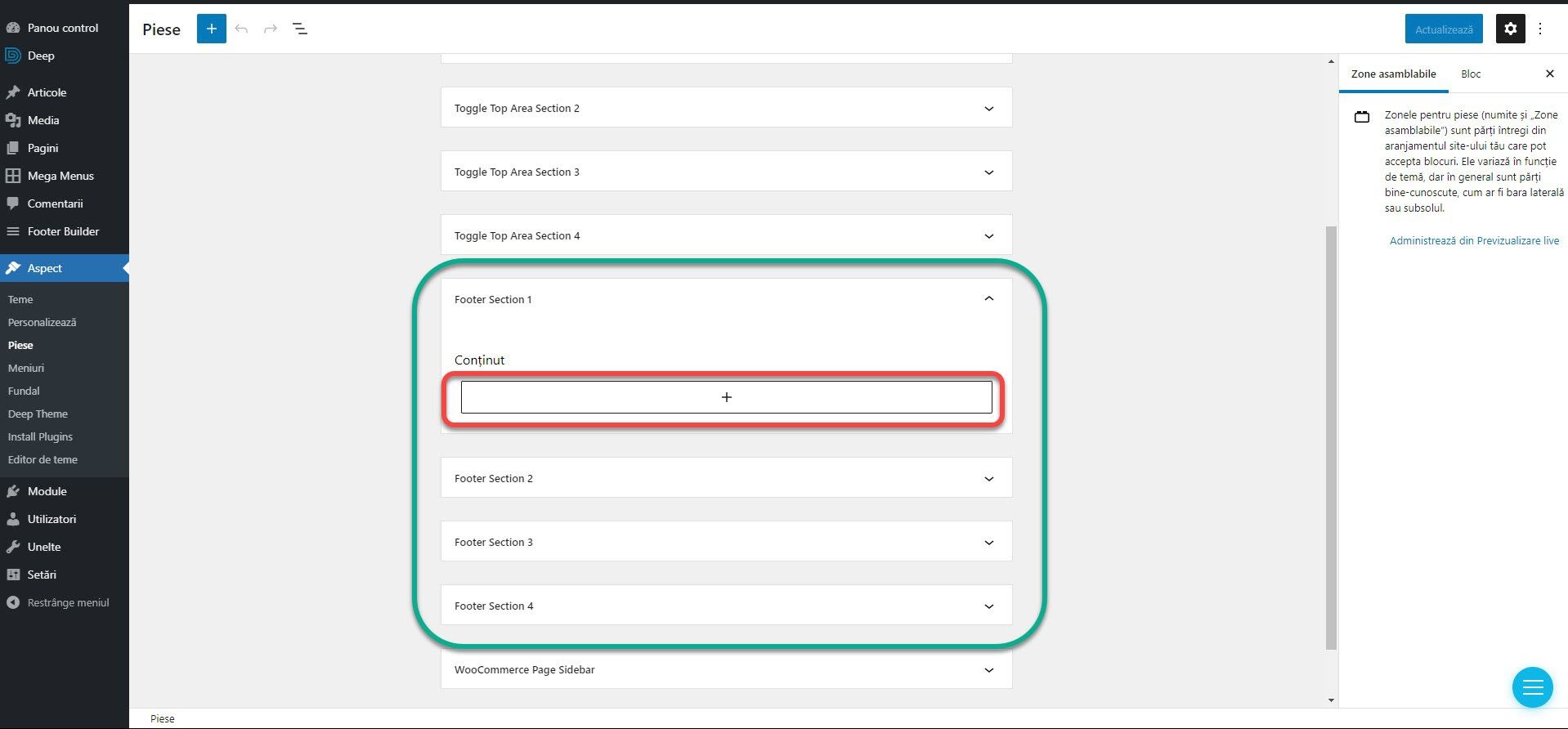
Here you will find different sections where you can place Widget elements. For footer, we are interested in sections Footer 1, 2 3 and 4. They correspond to the number of columns chosen from the theme settings in the previous article. If you chose only 2 columns, use Footer 1 and 2. If you chose 3 colors, Footer 1, 2, and 3. To add a Widget to a section, click the section name and then the Plus button.
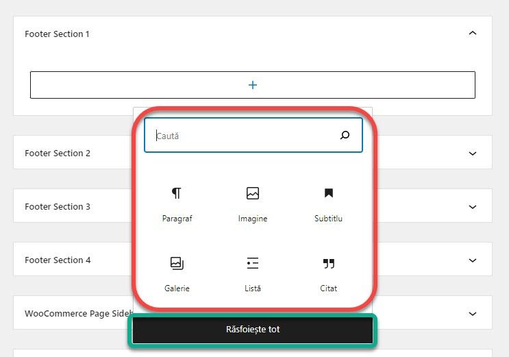
A window with 6 basic options will open. You can tap an item to add it, or you can tap Browse all to see the full list.
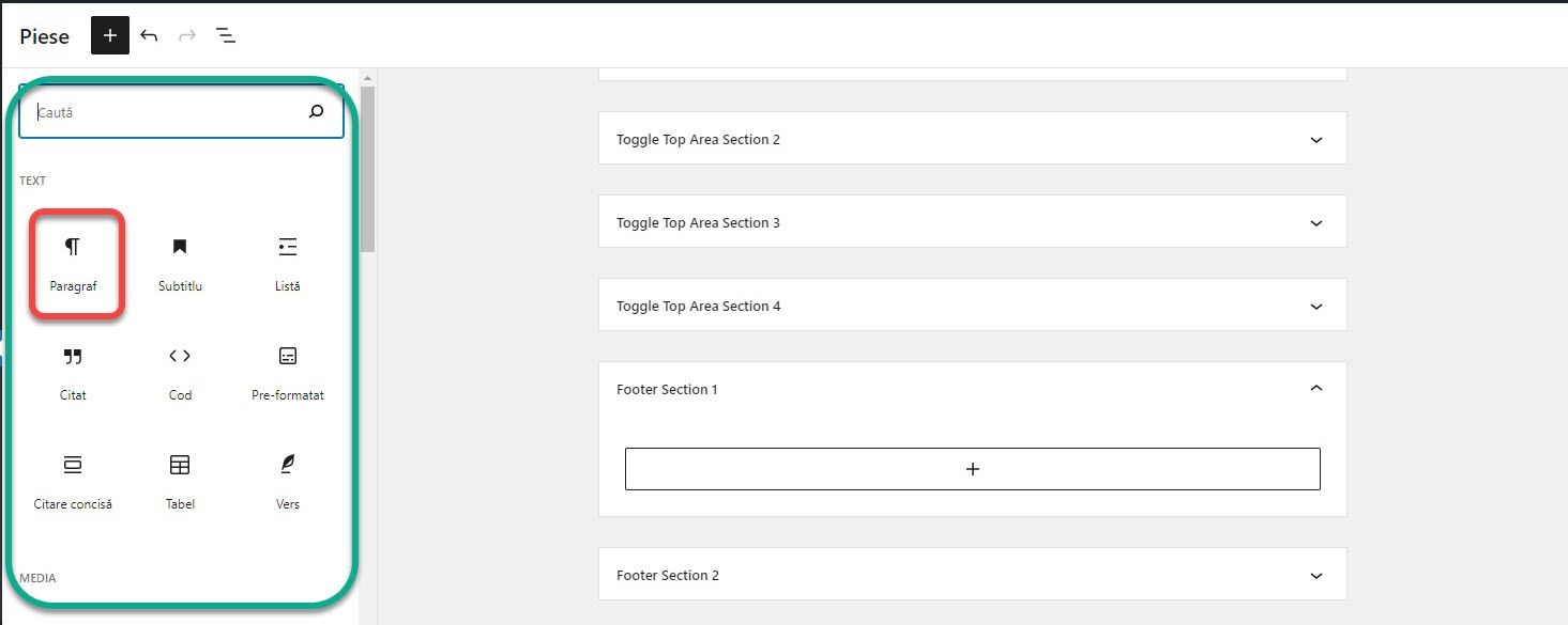
If you click Browse All, a complete list of Widgets will open on the side. Click on its name or icon to add it.
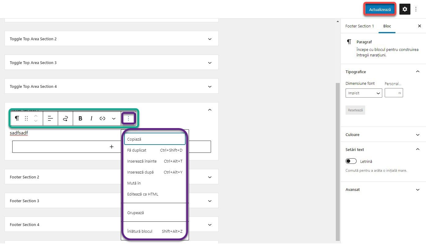
Once you add a widget you can customize it by clicking on it. A list of options will open. This differs for each type of widget. If you press the 3 vertical buttons, a new list will open, standard for all widgets that will allow you to change the order, copy, or even delete the widget. As with Header Builder, I will not explain each widget now, but I will do so in a separate article. Click on Publish to save the changes.
In the case of the Top Area, you are interested in the Toggle Top Area Sections 1, 2 3 and 4. The addition takes place identically as in the case of the Footer. Once you have populated the section, a plus will appear in the website at the top right, above the header. Once pressed it will display a container with the added widgets.
Some modules or themes will add new widgets that you can use. Also, the sections where you can add widgets differ from theme to theme. But it’s not something to worry about now. Although an article will follow in which I will explain some important elements of Header Builder and widgets, I encourage you to experiment with as many as possible and discover settings and customizations.
If you are confused or need help, I am waiting for you on the SenDesign Community Facebook group!
