How to create a website # 2: Installing the theme and plugins
17/09/2021
How to create a website #4: Header and footer
01/10/2021
How to create a website # 2: Installing the theme and plugins
17/09/2021
How to create a website #4: Header and footer
01/10/2021How to create a website #3: Customize the theme
The theme of a WordPress website dictates what the overall structure and style of the elements will look like. That is, the header, footer, buttons, fonts, text, colors, etc. A good theme lets you customize all these aspects and gives you a wide variety of options to choose from.
In previous articles I used the Deep theme because it is free and offers a good level of customization. The PRO version, which costs $67, offers many more options and comes with some important modules included in the price. But if you’re willing to invest in a theme, I recommend BeTheme. It’s the best theme I’ve tested. Each new version brings more and more important features and customizations. I do not use it in this series of articles to offer the option to study to those of you who do not have or do not want to invest money at the moment.
Be aware! I will not pretend that the themes and plugins that I will present in this series, including BeTheme, are not available for free on the internet. In most cases, they contain viruses. Upon activation, your website will be infected. Which is pretty hard to fix. Especially since the symptoms do not appear for authenticated users. On one domain, a long-term infection will damage the reputation even leading to the blocking of the website by browsers.
Returning to our website. The Deep theme requires a special module to be able to customize it. Go to Appearance, click on Deep Theme then click on Install Plugin. From here it installs and activates the Deep Core plugin.
A new button will appear in the left menu called Deep. Click on it then go to Theme Options. This is where the complete theme setup takes place.
Theme customization
I will explain the options offered here. Some of them are unique to this theme, but most are present in one form or another in any respectable WordPress theme. I will not explain all the options at once, but I will limit myself to important requests that will help you to personalize and define the style of your website. If you are not convinced that you need an option or do not understand what it does, you can ignore it until you feel the need to configure that specific area. At first it is normal to be undecided and then to change them completely after you have defined the content. Which we will cover in the following articles.
General Section
General Subsection:
- Responsive: It means that the theme will adapt to mobile. Always leave the option checked.
- Adaptive Images: Automatically adjusts images according to screen size. Always leave the option checked.
- Smooth Scroll: Change the scrolling speed of the website so that it is smoother.
- Admin Quick Access: Refers to the blue dot at the bottom right of the control panel. It has no effect on the website.
- Custom Favicon: The favicon is the website icon. It appears in the browser’s title bar, in the bookmarks bar, in the history, and wherever the website is displayed. Upload a small version of your logo here. Equivalent to the white F on a blue background from Facebook. Favicon is important for SEO.
Container Subsection:
- Layout: Wide spreads the website across the screen, as is the first SenDesign page, while Boxed limits it to a rectangle that does not touch the edges, such as the Facebook timeline. In Boxed mode you will not be able to have items in full screen. While in Wide mode, you will have the option to have very wide elements.
The other boxes affect the size on which the content will be spread depending on several types of screens. I recommend that you do not change them at this time. Unless you have a specific need. As a general rule, it is best to let the theme control this aspect.
Page Preloader Subsection:
The preloader is an image that appears while the website is loading. Gives the visitor something to watch while the files are loading. The preloader has 3 components: Background color, Logo and A loading animation.
- Page Preloader: Turns the preloader on or off.
- Page Preloader Spinkit Type: You can choose from several animation styles. (red box in the picture)
- Page Preloader Logo: The logo or image that will be displayed. Recommended to be a small one to load quickly (green box in the picture). More details on speed optimization in this article.
- Page Preloader Backgroud Color: Background color of the preloader.
- Page Preloader Timeout: Usually the preloader closes automatically after the page loads. But if it lasts a long time or errors occur, it is good to put a time after which it will disappear automatically. Values are measured in milliseconds. So 1000 milliseconds means 1 second. I recommend maximum would be 3 seconds ie 3000ms.
Scrollbar Section:
Here you can customize the look of the scroll bar.
- Customize Browser Scroll Bar: Enable bar customization.
- Cursor Color: Navigation button color (red arrow).
- Rail Background: Scrollbar background color (green arrow).
- Hide Animation: The scrollbar only appears if you place the cursor on it.
- Scrollbar Width: Dictates the width of the scrollbar.
- Inner Scrollbar Handle Color: Affects the color of the button for other scrolling items on the page.
Back to top Button Section:
Back to top is a button that appears when the user scrolls the page (red border). When you click on it, it will be sent to the top of the page. A very useful element in navigation.
- Back to top button: Activates the button.
- Custom Back to Top Button: Allows you to customize the appearance of the button.
- Select Desired Icon: You can choose from several button icons.
- Back to Top Border: Button outline color.
- Back to Top Background: Button background color.
- Back to Top Icon Color: The color of the button icon.
- Hover Back To Top Icon Color and Hover Back To Top Background: These are the colors when the user places the cursor on the button.
- Keep Back To Top Button On Mobile: Also displays the button on mobile.
We will skip the Toggle Top Area and White Label subsections because it does not help us to customize the website at the moment.
Footer Section
Here we control the appearance of the website footer. It is divided into three sections: Top Area, Footer and Bottom Area. In the picture, the green border represents Top Area, the purple border represents Footer and the red border represents Bottom Area.
Footer Top Area Subsection:
It is a section above the footer.
- Footer Social Bar: Displays the links to social networks that we will define later (red bix).
- Footer Instagram Bar: Instagram feed in the footer of the website. The setup requires an Instagram username and an access code that can be obtained by following this tutorial.
- Footer Subscribe Bar: To display a newsletter subscription box (green box). Supports Mailchimp or Feedburner integrations. The access code for Feedburner can be obtained by following this tutorial and for Mailchimp, this tutorial.
Footer Subsection:
- Footer Columns: Sets how many columns of content will be present and how they will be arranged. We will create the content in the next article.
- Footer Background Color: Sets the background color of the footer. It can also be transparent.
- Footer Background Color Style: There are two color styles, Dark and Light. They influence the style of the basement elements when there is content.
- Footer Background Image: If you want an image instead of the background color of the basement.
Footer Bottom Area Subsection:
It is a section below the contents of the basement.
- Footer Bottom:Activate the section.
- Footer Bottom Background Color: The background color of the section.
- Footer Bottom Left Area, Footer Bottom Center Area, Footer Bottom Right Area: Here you can choose what type of content to have in the 3 available areas. Copyright text, Logo, Social pages or a menu. We set the Menu, Logo and Text below, while for social pages we have a separate section.
- Footer Logo: Upload the logo you want to display.
- Footer Custom Copyright: The text for the Copyright option.
- Footer Menu: You choose from a list of menus. We will create a menu in the next article.
We’ll skip the Footer Builder subsection for now.
Pages Section
Page Options Subsection
- Sidebar position: In WordPress we can have a series of elements that remain static regardless of the page. For these we can define areas on the page on the left, on the right or both where to place content. We will return to this section in future articles.
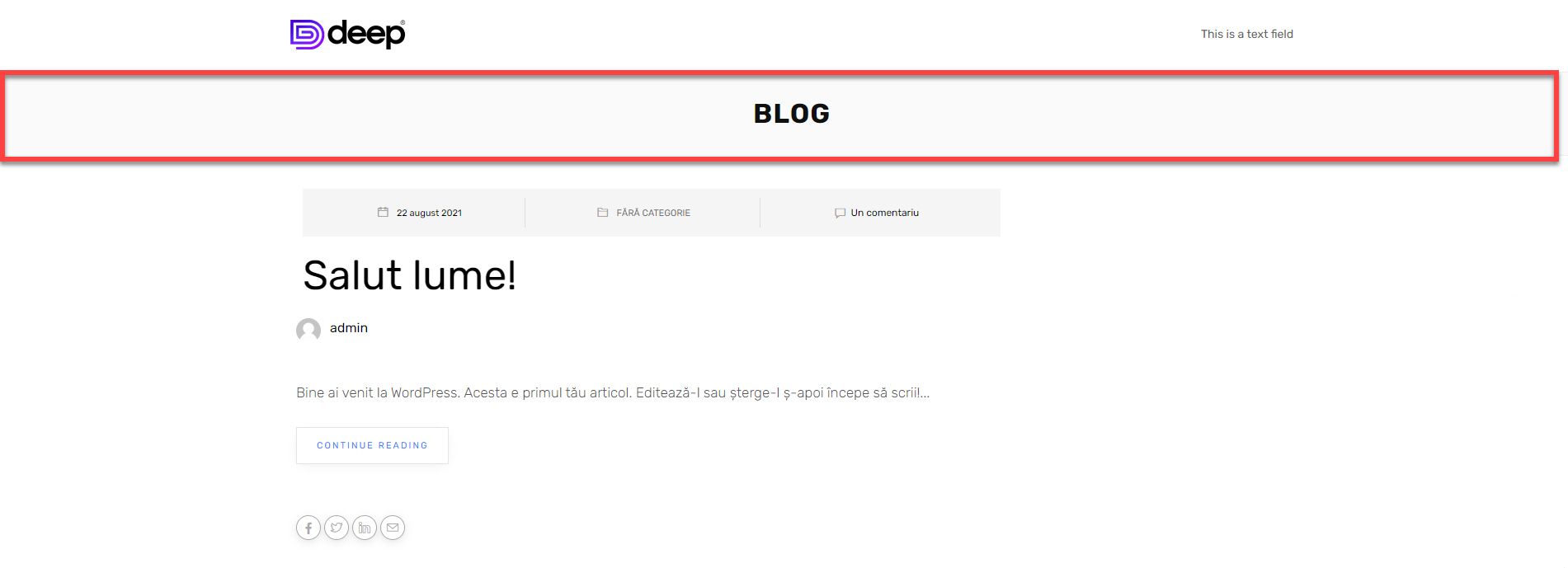
- Transparent Header: Each page has a small header with the title and path of the page. From here you can theoretically change his style. I basically didn’t notice anything changing here.
Page Title Subsection
- Page Title: Enables page title display (red box).
- Color: Change the title color.
- Background Color: Sets the background color of the title bar.
- Background Image: If you want an image instead of color.
- Background Image Position: How the image will be centered. For example, the top-left will align the beginning of the image to the top left corner.
- Text-Align: Title alignment.
- Font Size: Title size in pixels. For example 40px. Always add px at the end.
- Line Height: Row size in pixels.
- Height and Mobile Height: The height of the title container on the desktop or mobile.
- Padding: The free space between the title and the edges of the container. You can choose the units of measurement.
Breadcrumbs Subsection
Breadcrumbs are the path to the page you are on (red border) displayed under the page title. For example, the path to the contact page would be Home > Contact. Their purpose is to help the visitor understand what page they are on, and to easily return to the previous page.
- Breadcrumbs: Enables breadcrumbs display.
- Jetpack Breadcrumbs: It is an option dedicated to a special plugin and so we will ignore it.
- Breadcrumbs In Mobile: Enables breadcrumbs on mobile.
- Breadcrumbs Typography: You can set the breadcrumbs font. Font Family is the font, for example Ubuntu. Font Weight is the thickness, Font Size is the size, Line Height is the line height, Word Spacing is the distance between words and Letter Spacing is the distance between letters. Color font allows color change.
- Breadcrumbs Padding: The distance between the track and the edges of the border.
- Breadcrumbs Height and Mobile Breadcrumbs Height: The height of the space allocated for displaying the path on the desktop or mobile.
Styling Section
Background Subsection
- Body Background: The color or background image of the website.
- Background Pattern: Website background pattern. It is optional.
Colors Subsection
- Choose Color Skin: You can choose a color that is predominant in the website, for elements such as buttons or decorations. You can choose from a predefined list or your own color by selecting the Custom option.
- Links Color: The color of the links in the website. It is good to be different from the text so that the user can spot them.
- Selection color: Text color when a user makes a selection on the website (red box).
- Selection background: The background of the text when making a selection.
Typography Section
Here you select the fonts for all websites. There are several subsections: Body, Paragraph, Heading, Menu and Blog. Font Family is the font, for example Ubuntu, Font Weight is the thickness, Font Size is the size, Line Height is the line height, Word Spacing is the distance between words and Letter Spacing is the distance between letters. Color font allows color change.
We will play more with them when we come to a practical example of creating a website.
Social Networks Section
Here you can set up your social networks. Using the Select Social Type To Show option you can display the network icon or just its name. To add a network, put the URL of the page in the 1st Social URL field and in the 1st Social Name field choose the network type from the list. You add the following network in the 2nd Social, 3rd Social, etc. fields. To delete a network, simply delete the URL.
So much about customizing the theme. If you have not understood something or do not know what to choose, things will become clearer as we move forward in creating the website.
If you are confused or need help, I am waiting for you on the SenDesign Community Facebook group!
