How to create a website #5: Creating pages and posts
08/10/2021
How to create a website #7: How to create a beautiful website (II)
22/10/2021
How to create a website #5: Creating pages and posts
08/10/2021
How to create a website #7: How to create a beautiful website (II)
22/10/2021How to create a website #6: How to create a beautiful website (I)
The long-awaited moment has come when we will explore how to build a website using a practical example. I will not repeat all the steps in the previous articles, because you already know how to configure a theme, header and footer, how to create a page or a menu. Instead, I will detail configurations and content blocks. The article turned out to be very long, so I split it into two parts.
We will create a car service website. It is a practical example, which can often be found in this profession. Although they will initially make it in the pattern of a service provider, later (in another article) it will evolve into an online store. This way we go through all the use cases, regardless of the type of website you will need.
I will call the website Auto Focus. But you can give it any name you want. We have created a logo to use in this article, it can be downloaded here. Unzip the assets.zip archive to a handy directory. If you need a special logo for your website, I recommend the article The Secrets Behind a Successful Logo. The colors used will be #1584af (blue), #3a3a3c (dark gray) and #e4e4e4 (light gray). #1584af is the main color of the logo and we will use it for all major elements. #3a3a3c will be the secondary color of the website and #e4e4e4 will be the tertiary color. You can use these color codes to color different elements throughout this article.
To change the name of a WordPress website, click the Settings button on the control panel. In the Site Title field, enter Auto Focus or the name of your choice. A website may have a Tagline, which is displayed by name. For this example I chose the text For your car but you can choose another or even leave the field blank. Click the Save Changes button at the bottom of the page.
Theme Settings
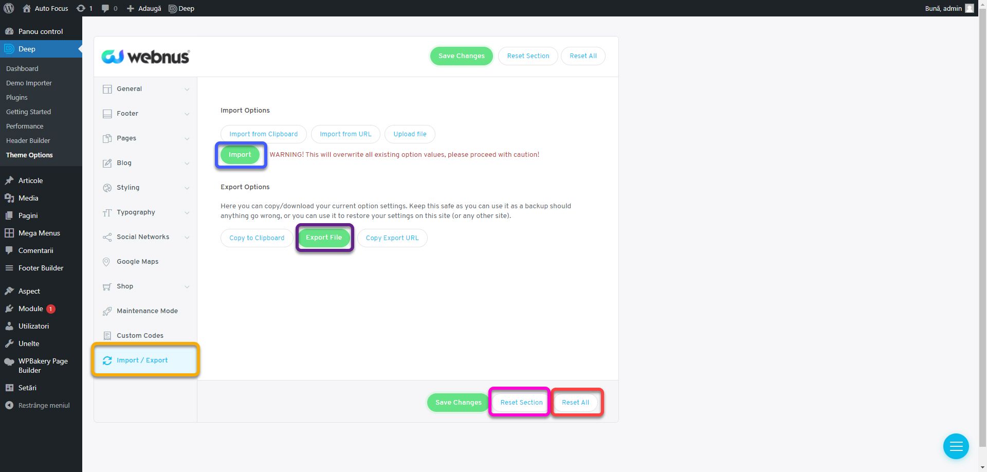
We now go to the theme settings (see Customizing the theme, if you have any questions). If you have already started a website and want to keep your theme settings, you can export them from the Import / Export section. Click Export File and save the file to your device. To re-import the settings, tap Import. If you want to completely reset the theme settings during this chapter to start over, press Reset All to reset all sections or Reset Section to reset only the current section.
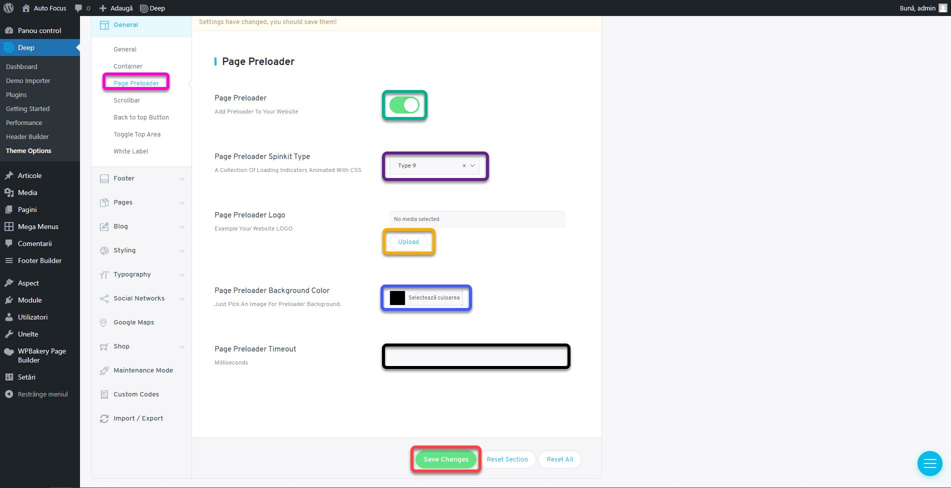
We will set a loading screen, because the theme offers this elegant option. Go to the General section, the Page Preloader subsection and activate it using the Add Preloader To Your Website check box. The Page Preloader Spinkit Type option sets the animation type. You can choose any option you like best. For Page Preloader Background Color insert the color code #1584af in the box next to the button. I recommend the color blue in this case because it allows the logo and animation to be visible. Page Preloader Timeout is the maximum value in milliseconds for which the loading screen will be displayed on the screen. Enter the value 3000, ie 3 seconds. To upload the logo, click the Upload button next to the Page Preloader Logo.
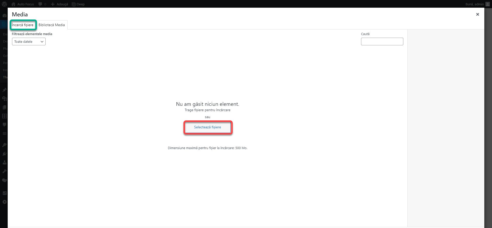
The media gallery will open here. Here you will find the images uploaded to the website. Since we haven’t uploaded anything, we’ll have a blank page. If you were able to upload an image, go to the Upload files section. Click the Select Files button. From the window that opens, navigate to the directory where you unzipped the assets.zip archive and choose the logo-monocrom.png file. This is a white version of the logo, which is used in colorful backgrounds, as we have here.
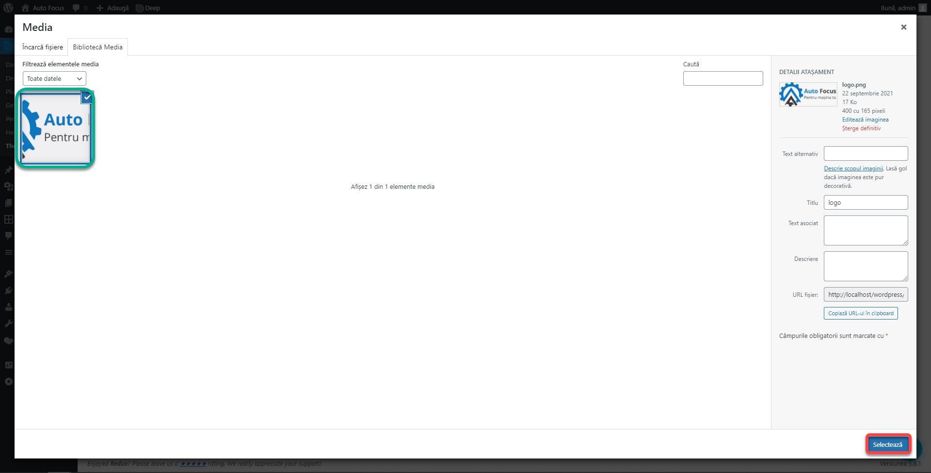
After uploading, make sure the new image is checked, and press the Insert into post button. This is the standard procedure for uploading an image to WordPress. All buttons, regardless of context, will lead to this gallery.
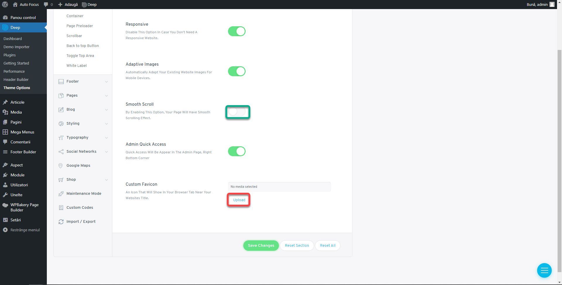
Click the Save Changes button before a section appears. Although when you browse through them you don’t lose the settings you made, it’s a safer (especially less confusing) way to make sure you don’t accidentally leave Teme Options and lose everything. In the General section, we will add the website icon using the Custom Favicon setting. The procedure is the same as above, but select the fav.png file. Optionally, you can activate the Smooth Scroll option.
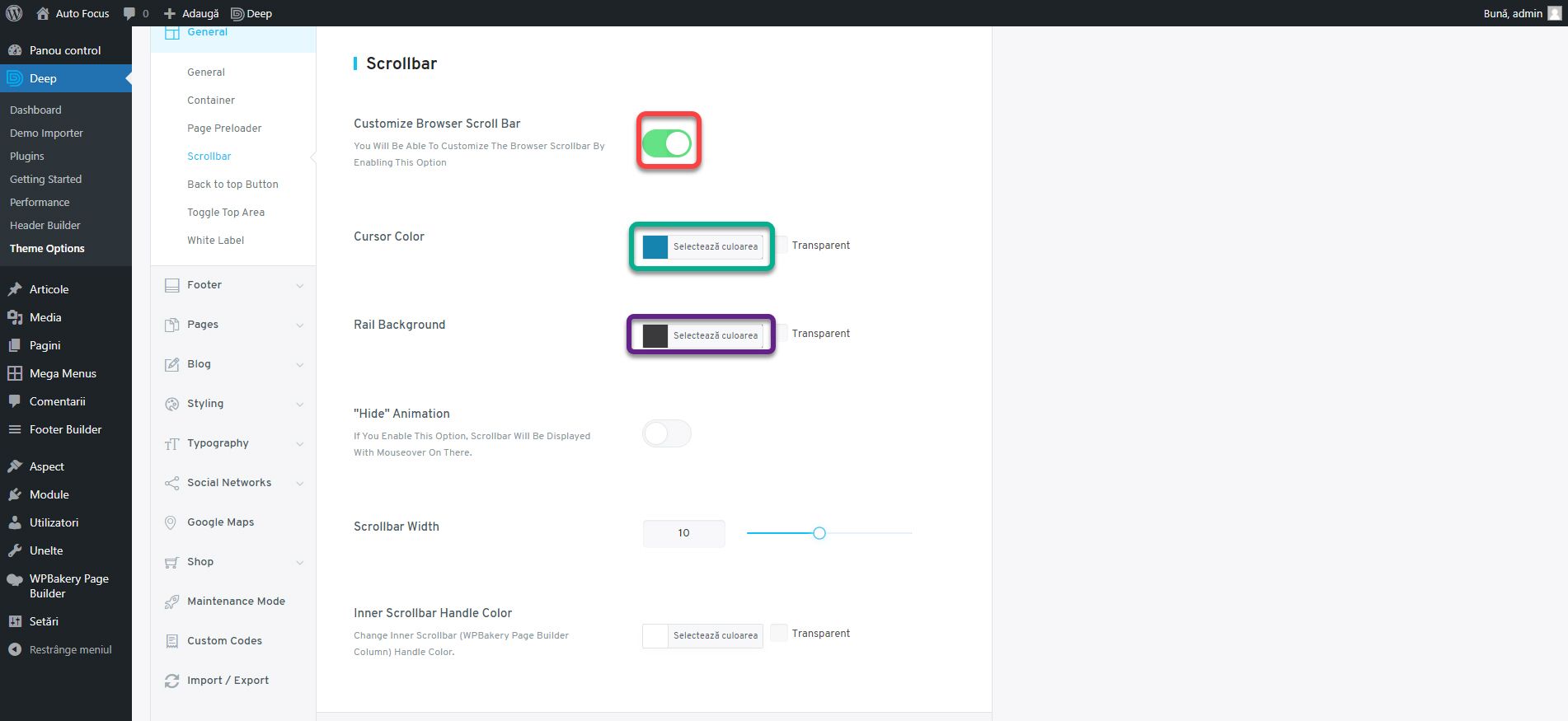
In the Scrollbar section, enable customization by checking the Customize Browser Scroll Bar. For Color Cursor, use #1584af and #3a3a3c for Rail Background.
In the Back to Top Button section, check Back To Top Button, Keep Back To Top Button On Mobile, and Custom Back To Top Button. New options will appear. Select an arrow type in the Select Desired Icon field. For the Back To Top Background and Hover Back To Top Icon Color options, enter the secondary color and for Back To Top Icon Color and Hover Back To Top Background, the main color. The result should look like the image on the right.
We go to the Footer section. From the Footer Top Area subsection, activate the Footer Social Bar. We will display the social networks above the footer.
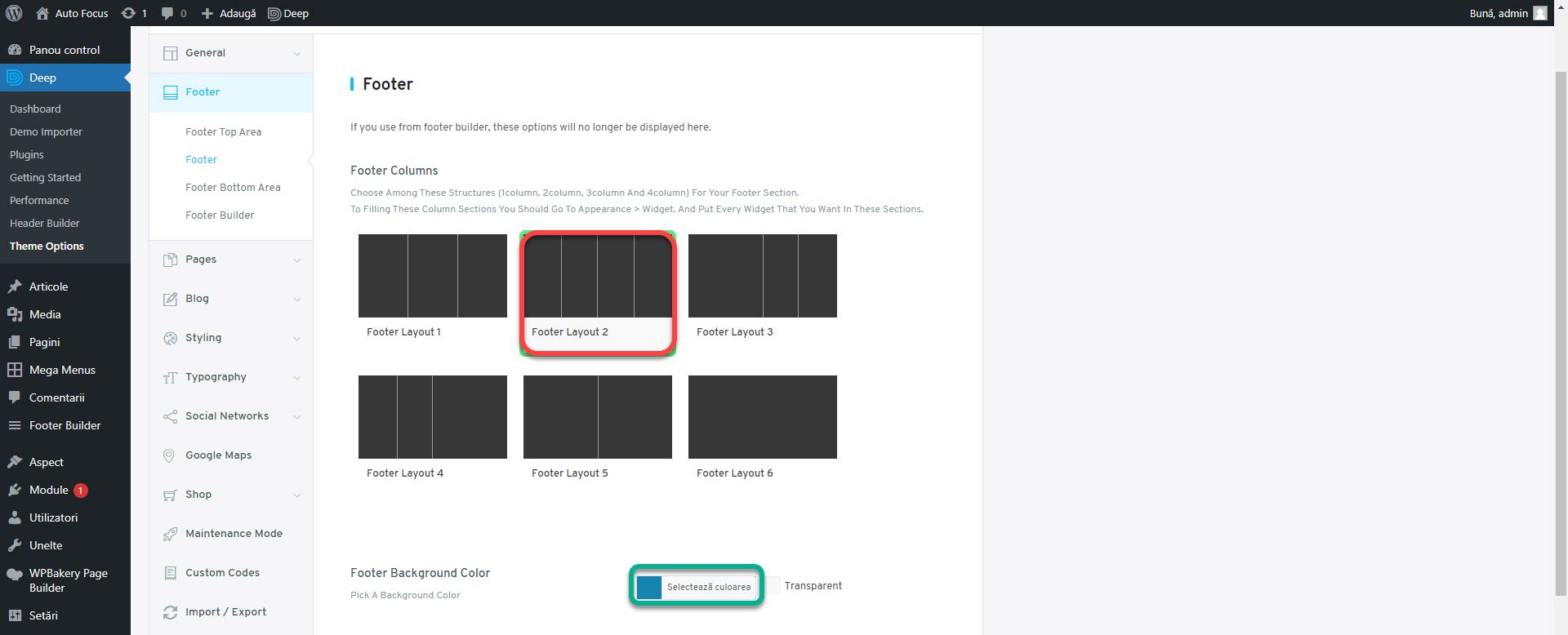
In the Footer subsection, set Footer Layout 2 for the Footer Columns setting and for Footer Background Color use the main color. We will have a basement of 4 blue columns.
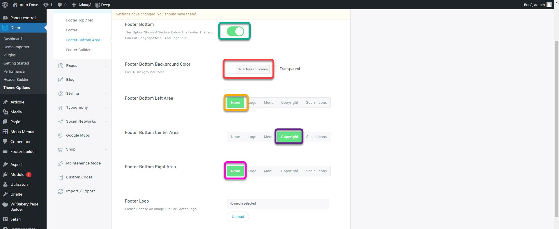
In the Footer Bottom Area subsection, enable Footer Bottom. It is a section under footer that we will use to display the copyright text. For Footer Bottom Background Color set the secondary color. For Footer Bottom Left Area and Footer Bottom Right Area, select None. We will not use them at this time. For Footer Bottom Center Area, choose Copyright. We display the social networks in the Footer Top Area, and we will place the logo later as a widget. That’s why we only need the copyright text.
In the Footer Custom Copyright enter the text Copyright Auto Focus 2021. All rights reserved. The basement is starting to take shape.
From the Pages section, go to Page Title. Here we change Color to #000000 and Background color to #e4e4e4.
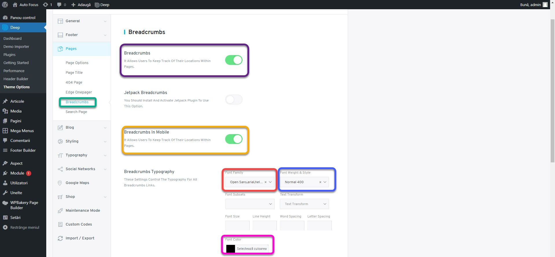
In the Breadcrumbs subsection, enable Breadcrumbs and Breadcrumbs In Mobile. For Font Family, set Open Sans with Normal Font Weight & Style Font. Font Color set it to #000000.
This part of the page, consisting of the title and breadcrumbs is usually called a subheader.
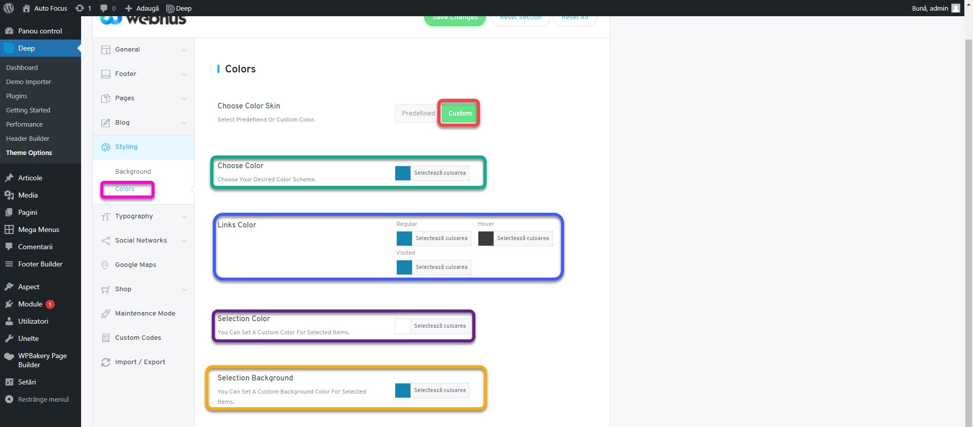
From the Styling section we go to Colors. Next to the Choose Color Skin option, click on Custom. Sets the main color for Choose Color, Color Links Regular, Links Color Visited, and Selection Background. Sets the secondary color for Links Color Hover and white for Selection Color. Selection color and background apply when you select text on a page. It will be white with a blue background. Color links influence how the links will look in the text of the website. Choose Color dictates the main color throughout the website.
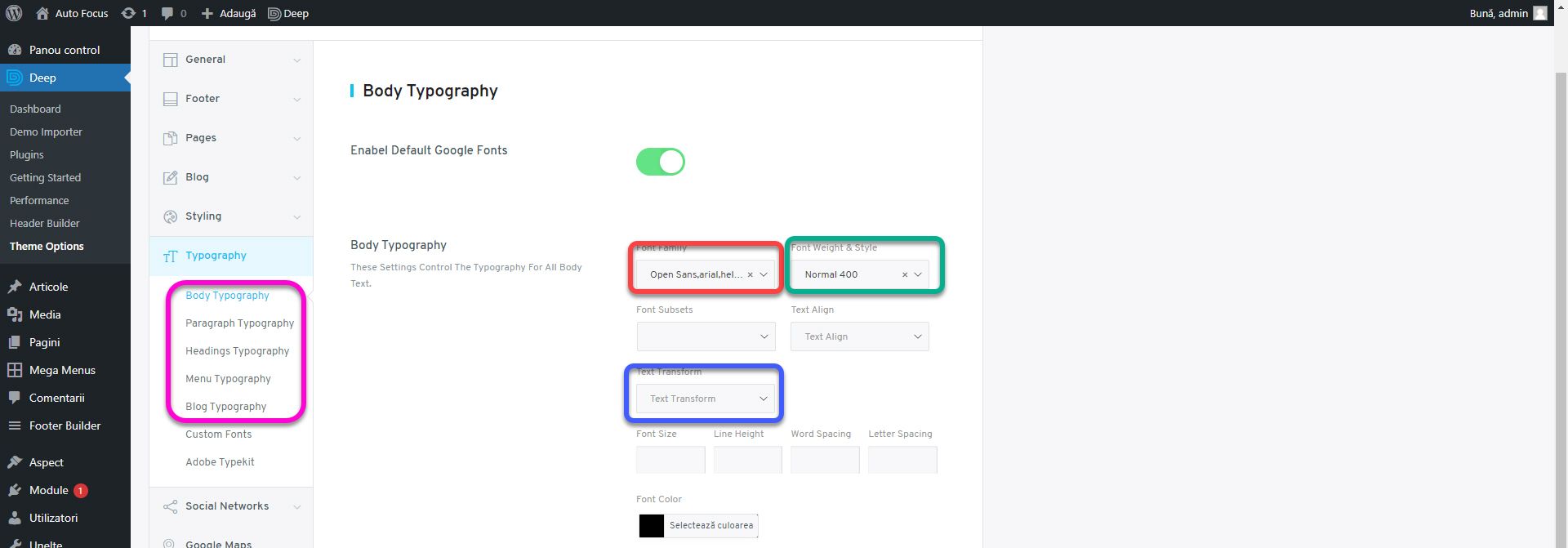
In the Typography section, set Font Family to Open Sans, Font Weight & Style in normal and Font Color #000000 for the Body, Paragraph, Headings, Menu and Blog subsections. Open Sans is the font used in the logo, from the Sans Serif family. Always respect the brand’s colors and font.
This is where the theme settings end. Optionally, you can change the social networks in the Social Networks section. For this example I will leave the basic values as we do not have social pages created.
Header Builder
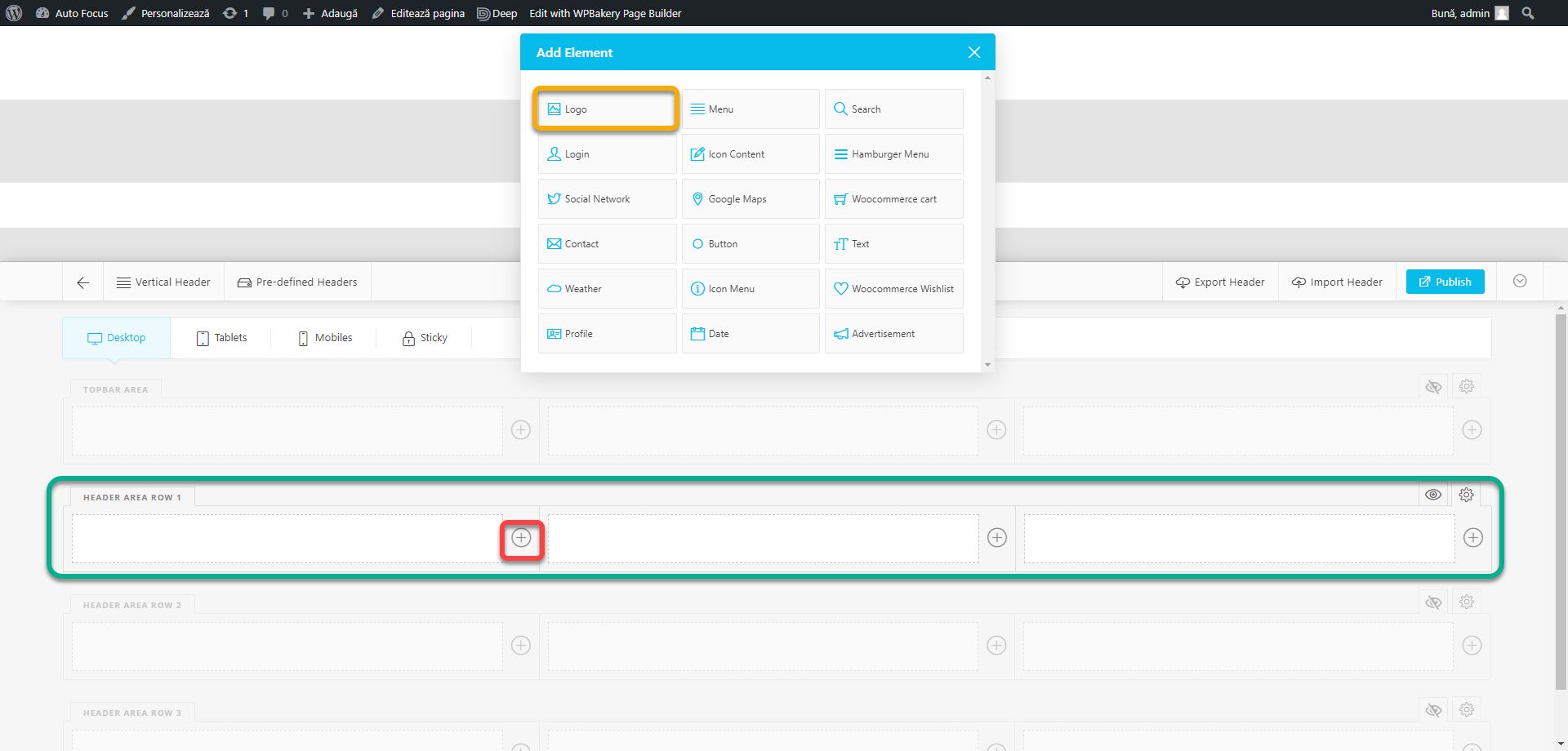
With the basic settings in place, it’s time to take care of the header. Enter Header Builder. Delete already placed blocks to start from scratch. In the Header Area Row 1 row, click on the plus in the first column. From the options window, click on the Logo.
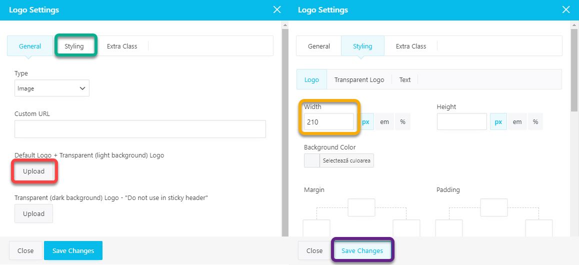
An options window will open. Click the Upload button next to Default Logo and select or upload the logo.png file from the assets.zip archive. Click Styling and set the Width to 210. Click Save Changes. We will have a logo on the first column 210px wide. In the styling window you can customize several aspects, such as edge, height, background color, borders or shadows. If you set Type to Text instead of Image in the General section, you will be able to enter text instead of image for the logo. Change the look in the Styling section, Text subsection. For the current example, no other settings will be required. Press X to close the window.
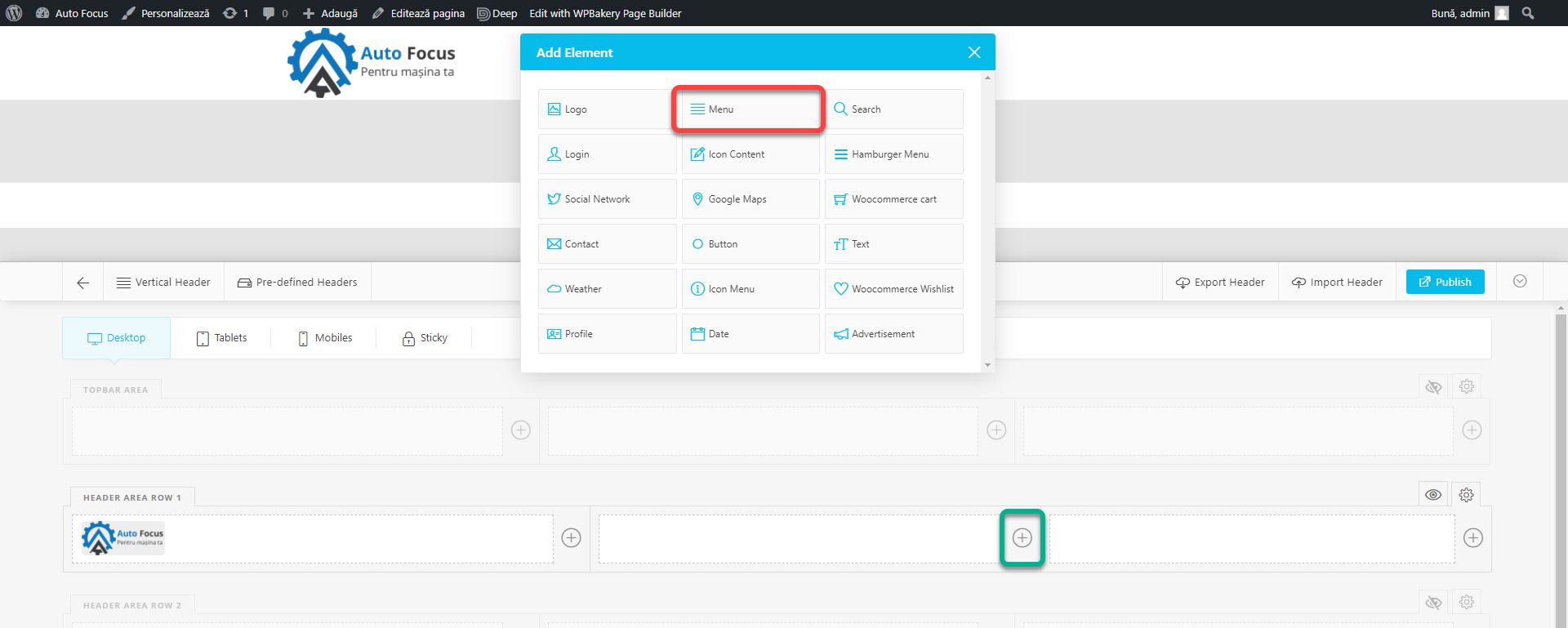
Click on the plus in the second column and choose the Menu block.
Select the menu created in the previous article in the drop-down menu of the Select a Menu option. If you do not have a menu created, you can create it now. Don’t forget to click Publish before leaving the page. After setting the menu, press Styling.
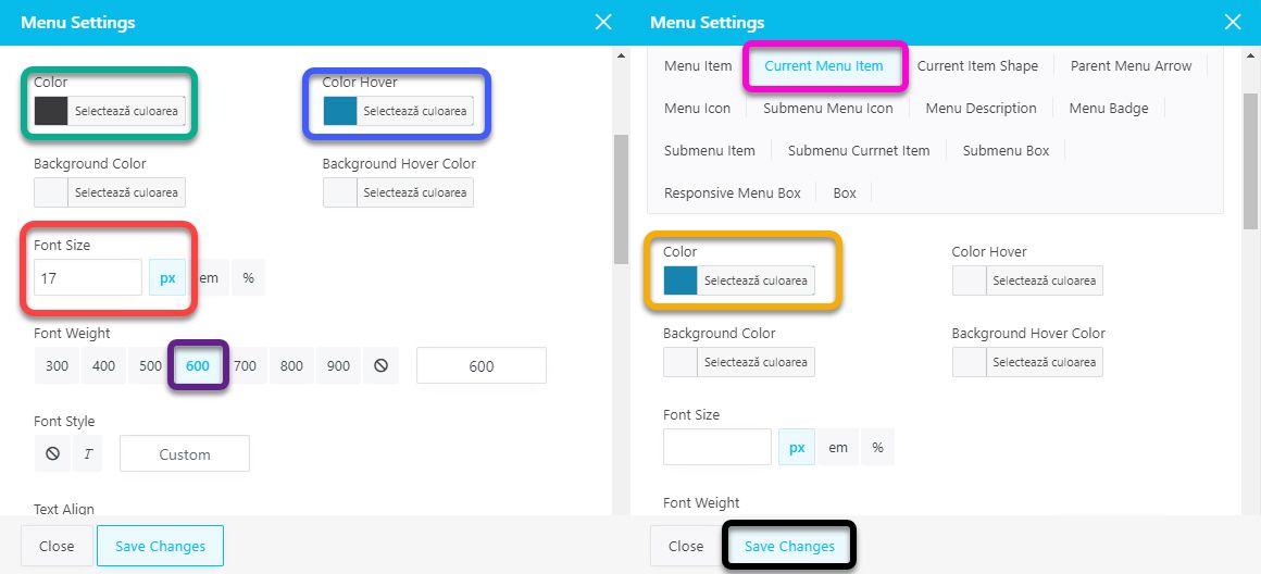
From the Menu Item subsection, set Color with the secondary color code and Color Hover with the primary color code. Thus the menu buttons will be gray and will turn blue when we place the cursor on them. Set Font Size to 17px and Font Weight to 600. It is important that the menu is visible. From the Current Menu Item subsection, set Color to the main color code. Current Menu Item allows you to change the appearance of the menu button that represents the current page. That is, if we are on the Home page, this button will be blue, while the others will be gray. If we go to the contact page, it will be blue and the others gray. Any changes in this subsection will override the general settings for the current page only. Click Save Changes and close the window.
If you now publish the changes and navigate to the website, you will notice that although the menu is in the middle column, it is not centered but leans to the right. This is a problem with this theme that is not present in others. To balance the menu in the middle, you must have an item the same width as the logo on the left. Which is not very convenient. That’s why we’ll move the menu next to the logo to align it to the left. Thus we will not take care of the symmetry. To move it, simply drag the menu to the desired location. Now we need to add some space between the logo and the menu. Place the cursor on the logo block and click on the pencil, which means editing.
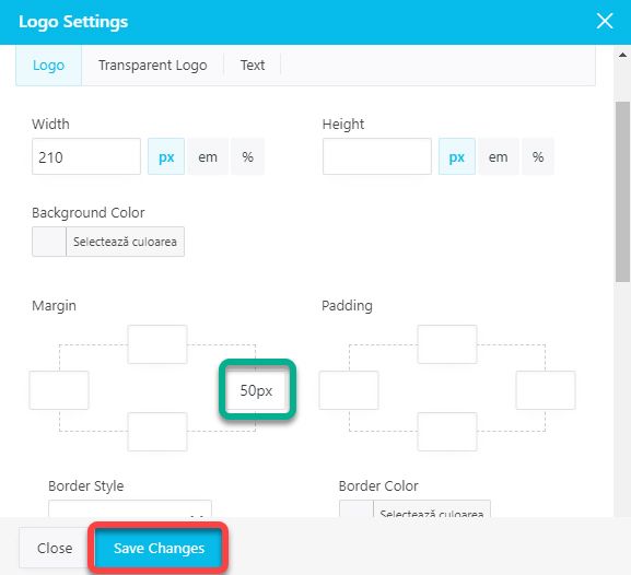
Go to Styling and enter the value of 50px in the right border of the margin section (green box). This way you can add distance between any elements. You can use padding to add distances inside the element and margin for distances outside the element. Click Save Changes.
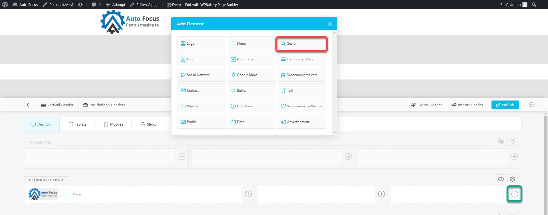
In the right column we will add the elements we want to highlight. Click on the plus and add the Search block.
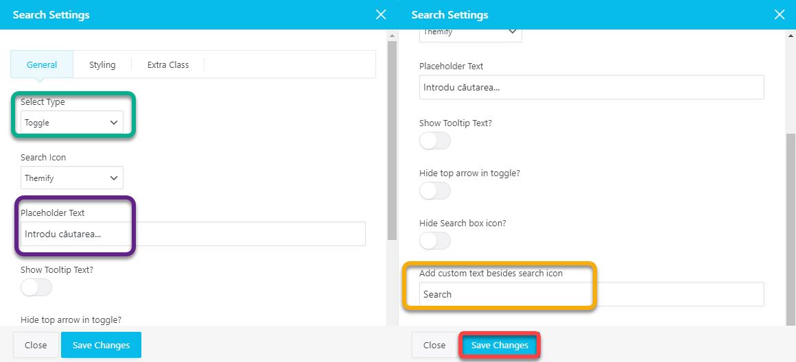
Sets Toggle in the Select Type field. It will hide the search box behind the icon. When the user clicks on it, the search box will appear below. For Placeholder Text, insert the text Enter search … This text will appear in the search box before the user types something and serves as a suggestion. Delete the text from the Add custom text besides search icon box because we only want the icon to be present. Click Save Changes.
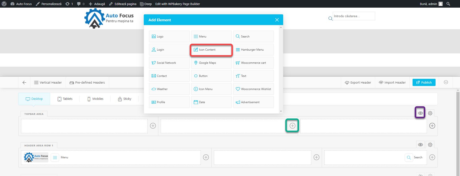
The contact details must be in the header. Click on the eye icon next to the Topbar Area to make this section visible. In the middle column of this row, press plus and add Icon Content. This block allows you to add text next to an icon.
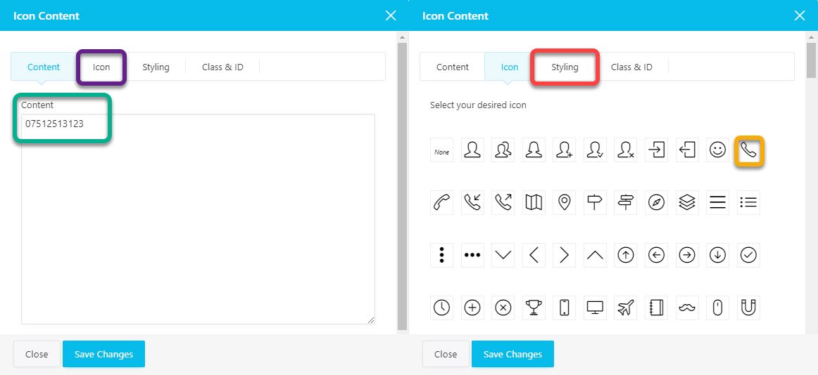
In the Content section, enter a phone number. In the Icon section, choose an appropriate icon, in this case a phone. Go to Styling.
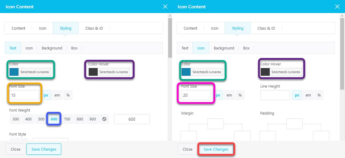
In the Color field, set the primary color, and in the Color Hover field, set the secondary color in the Text and Icon subsections. In the Text subsection set Font size to 15, and Font Weight to 600. In the Icon subsection set Font Size to 20 and click Save Changes.
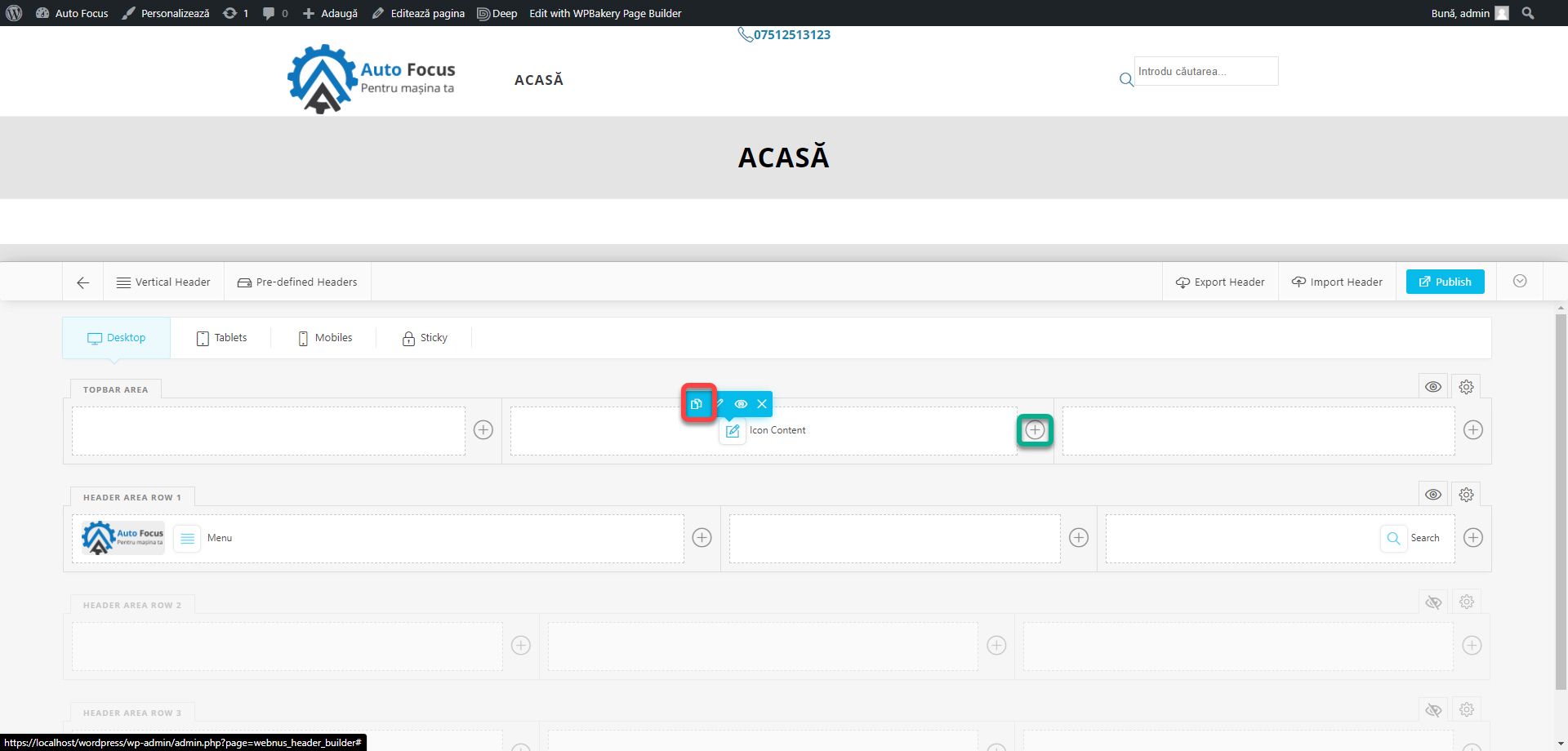
We also need to add an email address icon. Click on the duplicate command of the newly created block and then click on the plus in the middle column.
A new block will appear in the list called Paste. It will place a copy of the copied block.
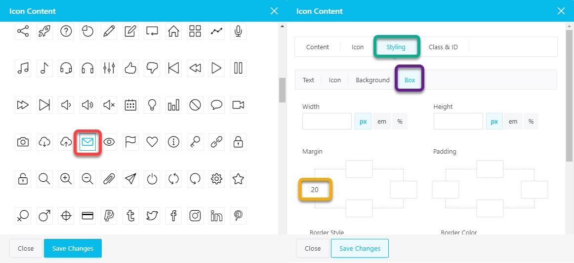
Instead of the phone number, enter an email address and change the icon with an envelope. If you publish the changes, you will notice that the two elements are glued together. They need space to be legible. Go to the email address block settings in the Styling section of the Box subsection and add 20px to the left margin. Box controls the entire element, both the text and the icon.
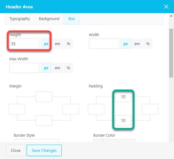
Two further observations can be made. The first is that the two blocks are very close to the top of the website. And the second is that the design is a bit dry and uninspired. Especially when the menu is empty, the two elements seem to float without purpose. To solve this issue, we will better highlight the top section. Tap the settings cog next to the Topbar Area. In the Styling section, the Background subsection, set the main color in the Background Color field. Go to the Box subsection.
Here, set the Height field to 35px, and in the Padding field add 10px up and down, which will add a distance between the elements and the edges of the section. Now the Topbar area is well defined and has a nice look but the phone number and email address are no longer visible. Edit both blocks, and from the Styling section, change the Color attributes for Text and Icon to white (#ffffff).
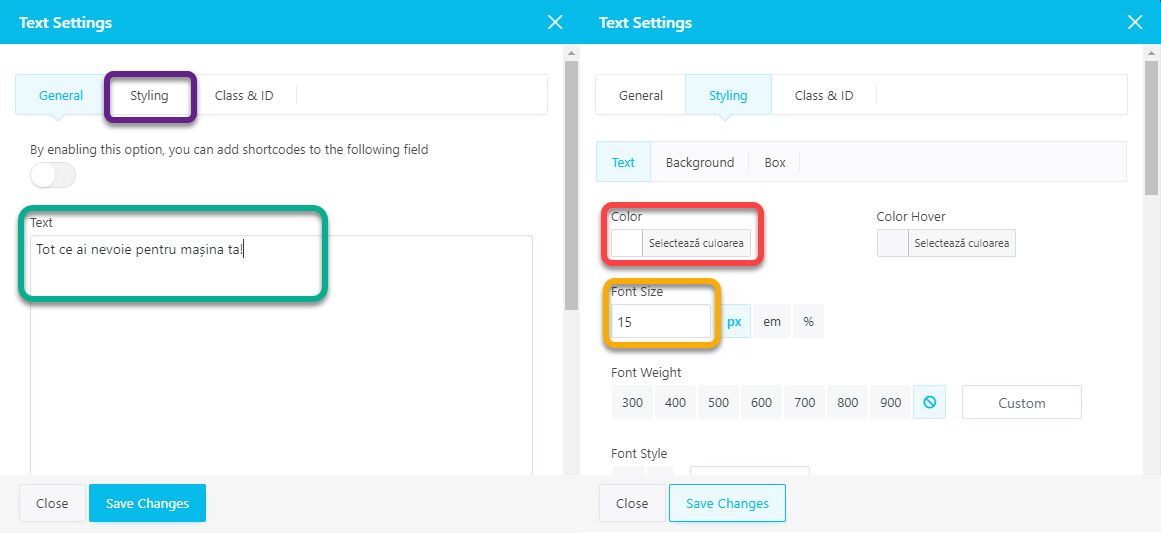
In the first column, add the Text block. It is used to display simple messages.
In the Text field, we will insert a short slogan message. We have chosen Everything you need for your car!. In the Styling section, set Color to White (#ffffff) and Font Size to 15px.
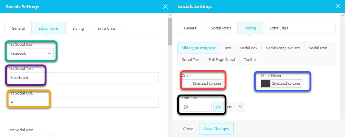
In the third column add the Social Network block. Here we will configure the display of social networks.
In the Social Icons section, add some social networks. In the Social Icon field choose the type of network, in the Social Text field enter the network text (it is used in certain types of controlled views in the General section) and in the Social URL add the link to the corresponding page. In the Styling section, the Slide type Icon subsection, set the Color field to white and the Color Hover field to the secondary color. Font Size to be 20px.
We will stop here with this article. If you have followed all the steps, the website should look like in the image below. In the next part we will deal with the footer and the first page. Remember that the design is indicative. I provided an example of design, not nailed rules. You can experiment with new locations.
If you are confused or need help, I am waiting for you on the SenDesign Community Facebook group!
